Every Picture Is a Compromise
Lessons from the Also-rans
Most photography websites show the photographer's very best work. Wonderful. But that's not the full story of a creative life. If we want to learn, we'd better pay attention to the images that aren't "greatest hits" and see what lessons they have to offer. Every picture is a compromise — the sum of its parts, optical, technical, visual, emotional, and even cosmic – well, maybe not cosmic, but sometimes spiritual. Success on all fronts is rare. It's ok to learn from those that are not our best.
This is a series about my also-rans, some of which I've been able to improve at bit (i.e., "best effort"), none of which I would consider my best. With each there are lessons worth sharing, so I will.
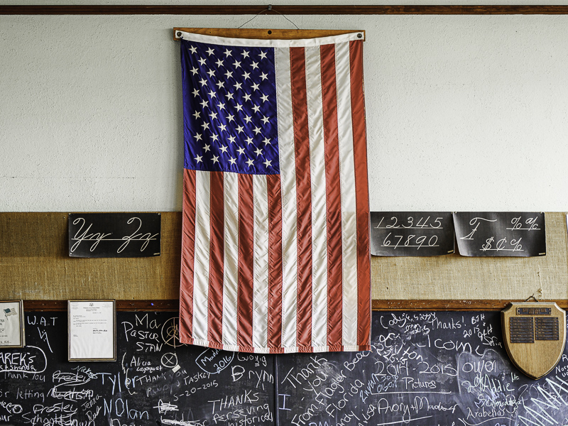
Original digital captureWhat I saw that I liked:These images illustrate my comments in this Here's a Thought commentary. What I don't like in the picture:The above is a failure to see in wide angle. There is so much wrong with this image I'm not sure where to begin. Scattered, distracting, cluttered, disorganized, ugh. A total failure to "assemble the image" in my mind's eye and then compose to the best focal length. What I learned:Compare the mess above to the organized image at left. This is an example my natural vision to zoom to the details that matter. 2nd Chances: What I might try nextI'd like to take some more green out of the upper wall. |


