Every Picture Is a Compromise
Lessons from the Also-rans
Most photography websites show the photographer's very best work. Wonderful. But that's not the full story of a creative life. If we want to learn, we'd better pay attention to the images that aren't "greatest hits" and see what lessons they have to offer. Every picture is a compromise — the sum of its parts, optical, technical, visual, emotional, and even cosmic – well, maybe not cosmic, but sometimes spiritual. Success on all fronts is rare. It's ok to learn from those that are not our best.
This is a series about my also-rans, some of which I've been able to improve at bit (i.e., "best effort"), none of which I would consider my best. With each there are lessons worth sharing, so I will.
|
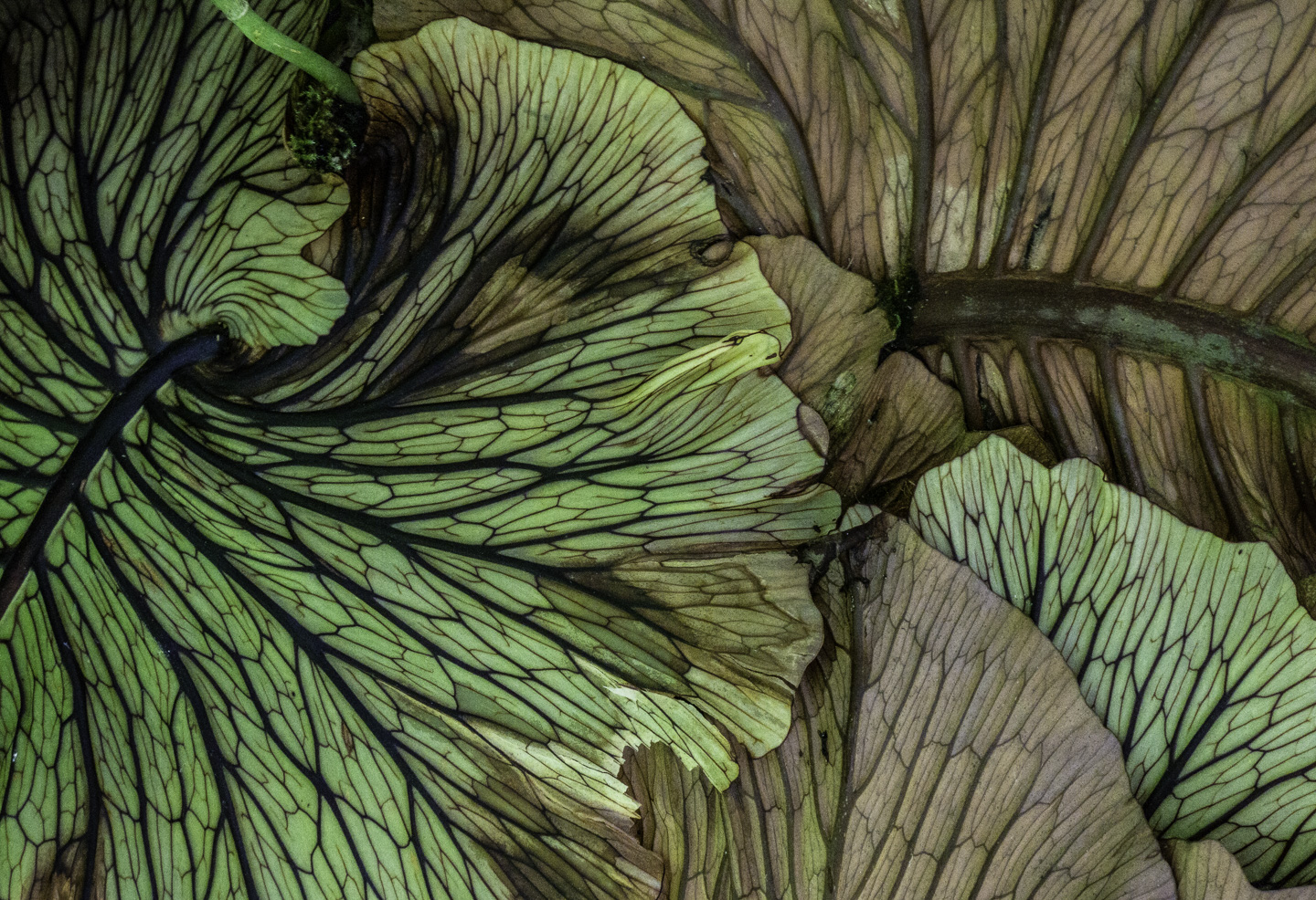
Original digital capture
What I saw that I liked:A lovely botanical in Hawaii. What I don't like in the picture:Decisions, decisions, decisions. Color or b/w? What I learned:As an old-school b/w photographer, I tend to default to b/w because that was my training and still is my preference for so many images. But with a botanical like this one, I'm often torn. Color adds life to the image; b/w emphasizes line and form. Which is right? Is this even a valid question? I get easily stumped. I like both renditions of this image. I've used both in different projects. I guess that's the answer — use the version that's right for the project. If it's a stand-alone image outside a project, the puzzle still exists. 2nd Chances: What I might try nextSelective color? |