Every Picture Is a Compromise
Lessons from the Also-rans
Most photography websites show the photographer's very best work. Wonderful. But that's not the full story of a creative life. If we want to learn, we'd better pay attention to the images that aren't "greatest hits" and see what lessons they have to offer. Every picture is a compromise — the sum of its parts, optical, technical, visual, emotional, and even cosmic – well, maybe not cosmic, but sometimes spiritual. Success on all fronts is rare. It's ok to learn from those that are not our best.
This is a series about my also-rans, some of which I've been able to improve at bit (i.e., "best effort"), none of which I would consider my best. With each there are lessons worth sharing, so I will.
|
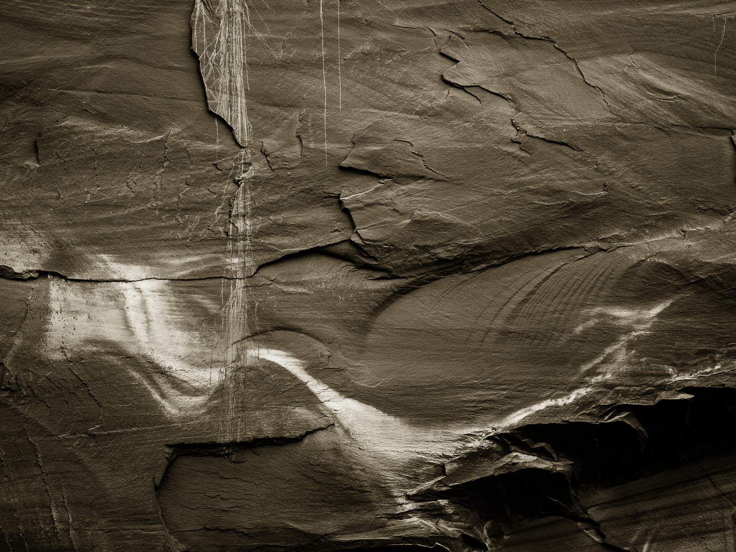
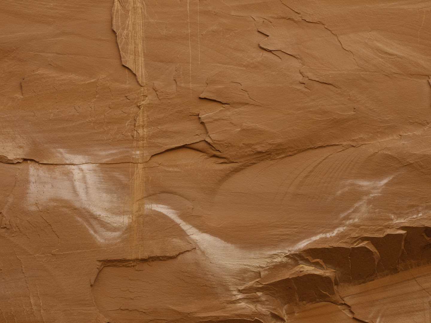
Original digital capture
What I saw that I liked:Like yesterday's example, here is another spot in Capitol Reef where the natural color of the rock looks fake, but is actually realistic. What I don't like in the picture:Those vertical lines remind me of dripping water and the white swirl in the bottom half reminds me of a flow of water. Neither of them look like that, however. What I learned:The version at left took quite a bit of work to increase the contrast, neutrailze the orange/red color in the rock, enhance the textures, and make the water "flow." How many times have I said, "It's not what you take, but what you make that counts." Plus 1. 2nd Chances: What I might try nextBTW, this 12 megapixel image makes a lovely 16x20" print. |