Every Picture Is a Compromise
Lessons from the Also-rans
Most photography websites show the photographer's very best work. Wonderful. But that's not the full story of a creative life. If we want to learn, we'd better pay attention to the images that aren't "greatest hits" and see what lessons they have to offer. Every picture is a compromise — the sum of its parts, optical, technical, visual, emotional, and even cosmic – well, maybe not cosmic, but sometimes spiritual. Success on all fronts is rare. It's ok to learn from those that are not our best.
This is a series about my also-rans, some of which I've been able to improve at bit (i.e., "best effort"), none of which I would consider my best. With each there are lessons worth sharing, so I will.
|
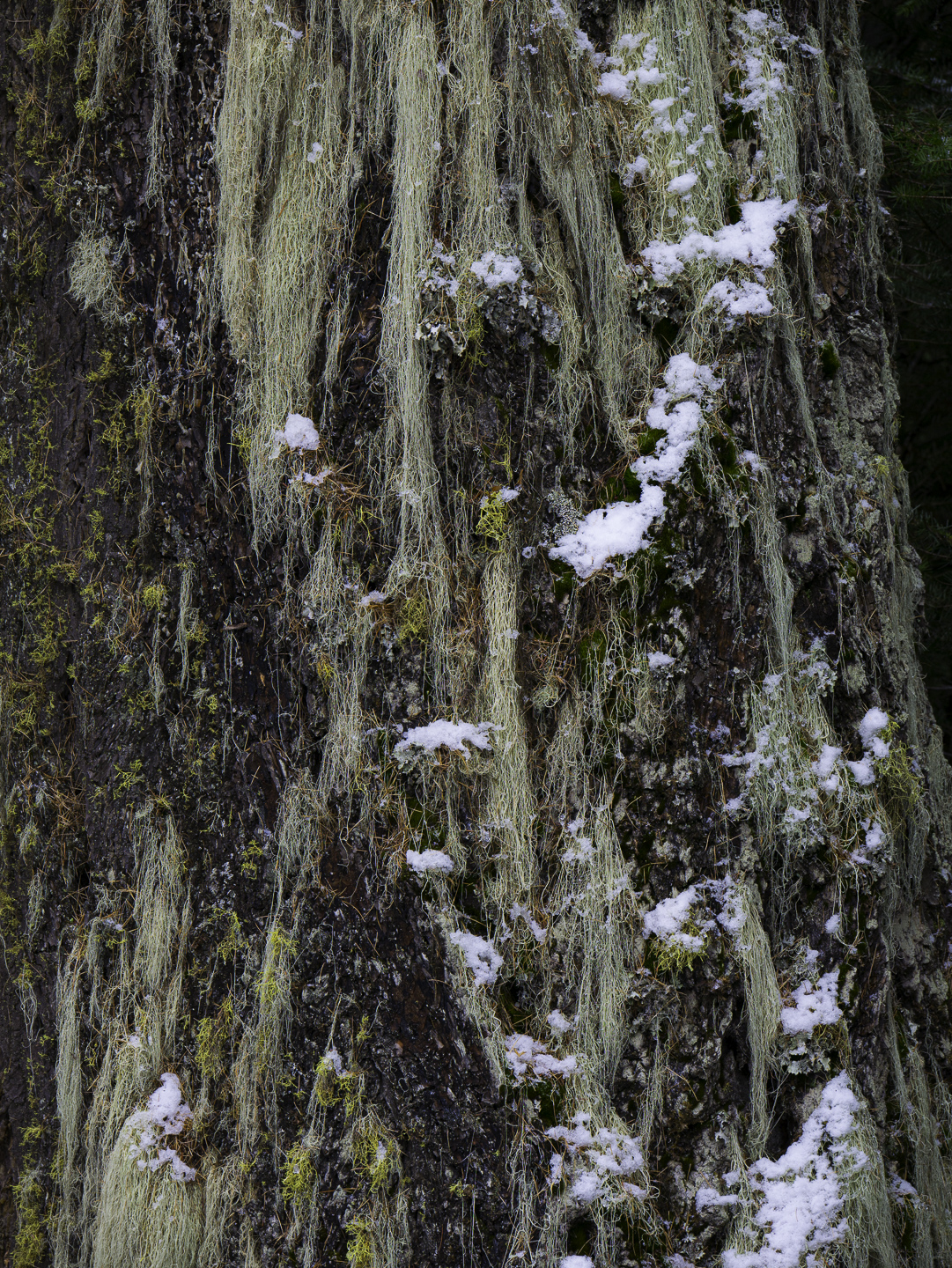
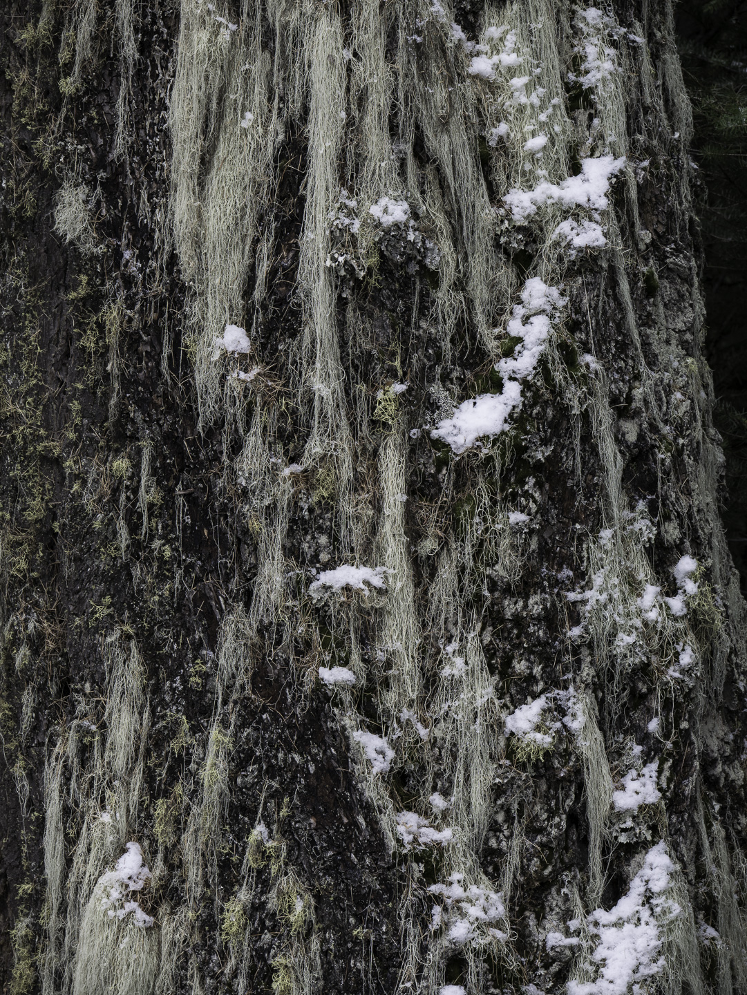
Original digital capture
What I saw that I liked:The contrast of moss versus snow. What I don't like in the picture:As a general principle, I'm not fond at all of the current trend in photography to pump up the saturation and vibrance to unrealistic colors. It always seems hyper-real to me. That's a nice way of saying it looks fake. What I learned:Like all "rules" and "principles," there are times when it seem appropriate to break them. This is such an image. The above was how my camera captured it. To my eye, it seems weak and almost monochromatic. A subtle increase in vibrance and saturation brings out enough of the color to make the contrast with the snow seem closer to what my eye saw. Rules, smoolze. 2nd Chances: What I might try nextNo idea wha to do with that upper right corner. Gotta go, but I haven't yet figured out how. |