Every Picture Is a Compromise
Lessons from the Also-rans
Most photography websites show the photographer's very best work. Wonderful. But that's not the full story of a creative life. If we want to learn, we'd better pay attention to the images that aren't "greatest hits" and see what lessons they have to offer. Every picture is a compromise — the sum of its parts, optical, technical, visual, emotional, and even cosmic – well, maybe not cosmic, but sometimes spiritual. Success on all fronts is rare. It's ok to learn from those that are not our best.
This is a series about my also-rans, some of which I've been able to improve at bit (i.e., "best effort"), none of which I would consider my best. With each there are lessons worth sharing, so I will.
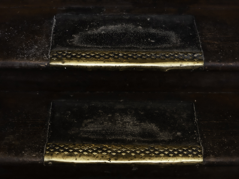
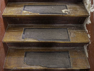
Original digital capture2nd Time Around WeekWhat I saw that I liked:Sometimes an idea just sticks with you. I photographed these steps (above) in a pioneer school in North Dakota. What I don't like in the picture:The photo is just ok at best. Rather dull and lifeless. What I learned:I remembered the feeling I was trying to get across was the wear on the steps. I was imagining all the kids and the trips up and down. The stairs at left were in an old hotel and the metal step guard and the shiny, polished surface did a better job of illustrating my point. Still not a great shot, but better than the first attemp five years earlier. 2nd Chances: What I might try nextI might try to recover some of those blown highlights in the metallic surface. |


