Every Picture Is a Compromise
Lessons from the Also-rans
Most photography websites show the photographer's very best work. Wonderful. But that's not the full story of a creative life. If we want to learn, we'd better pay attention to the images that aren't "greatest hits" and see what lessons they have to offer. Every picture is a compromise — the sum of its parts, optical, technical, visual, emotional, and even cosmic – well, maybe not cosmic, but sometimes spiritual. Success on all fronts is rare. It's ok to learn from those that are not our best.
This is a series about my also-rans, some of which I've been able to improve at bit (i.e., "best effort"), none of which I would consider my best. With each there are lessons worth sharing, so I will.
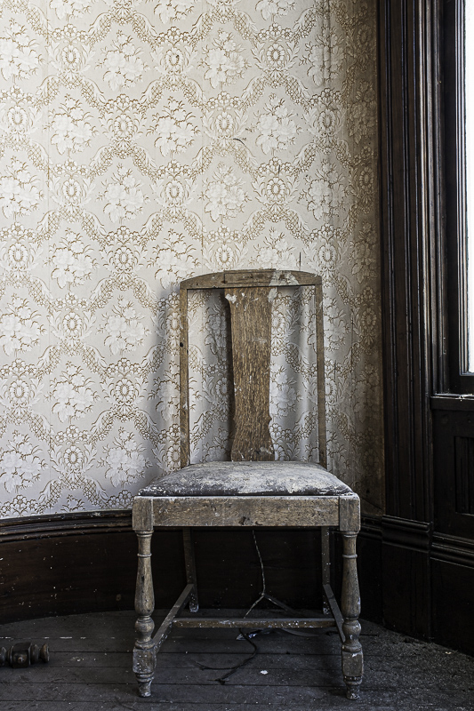
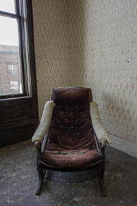
Original digital captureWhat I saw that I liked:I'm a pushover for chairs. What I don't like in the picture:Compare these two carefully. I don't know about you, but the one above throws me a bit off balance. I find myself leaning forward, uncomfortably. What I learned:I think the problem is that slanted vertical in the windowsill behind the chair. In the example at left, the window is rectified. Somehow, that makes the image seem stable and the chair more solid. Notice this has nothing to do with the chairs themselves, but is strictly a function of the supposedly unimportant background. 2nd Chances: What I might try nextI tried rectifying the window in the above, but it distorted the shape of the chair to an unreal amount. |


