Every Picture Is a Compromise
Lessons from the Also-rans
Most photography websites show the photographer's very best work. Wonderful. But that's not the full story of a creative life. If we want to learn, we'd better pay attention to the images that aren't "greatest hits" and see what lessons they have to offer. Every picture is a compromise — the sum of its parts, optical, technical, visual, emotional, and even cosmic – well, maybe not cosmic, but sometimes spiritual. Success on all fronts is rare. It's ok to learn from those that are not our best.
This is a series about my also-rans, some of which I've been able to improve at bit (i.e., "best effort"), none of which I would consider my best. With each there are lessons worth sharing, so I will.
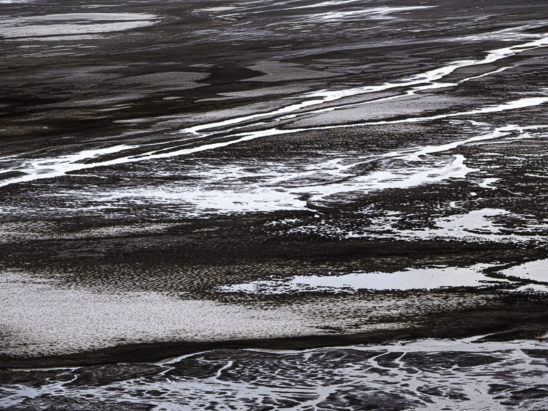
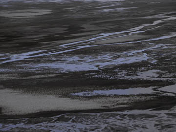
Original digital captureMud and Muck WeekWhat I saw that I liked:Water meets the land. What I don't like in the picture:Straight photography can often be far too descriptive. "This is what it looks like." What I learned:One of the reasons I like to abstract the world is that it allows me to shift from "what it looks like" into "what it feels like." The image at left was my emotional reaction to the scene. So which is more "life-like"? The emotionless rendition above, of the dance of light and dark in the one on the left? 2nd Chances: What I might try nextIn my first processed version, I left the water blue. After living with this one for a while, I decided the blue needed to be subtle, just barely coming through — like the subtle browns in the mud. |


