Every Picture Is a Compromise
Lessons from the Also-rans
Most photography websites show the photographer's very best work. Wonderful. But that's not the full story of a creative life. If we want to learn, we'd better pay attention to the images that aren't "greatest hits" and see what lessons they have to offer. Every picture is a compromise — the sum of its parts, optical, technical, visual, emotional, and even cosmic – well, maybe not cosmic, but sometimes spiritual. Success on all fronts is rare. It's ok to learn from those that are not our best.
This is a series about my also-rans, some of which I've been able to improve at bit (i.e., "best effort"), none of which I would consider my best. With each there are lessons worth sharing, so I will.
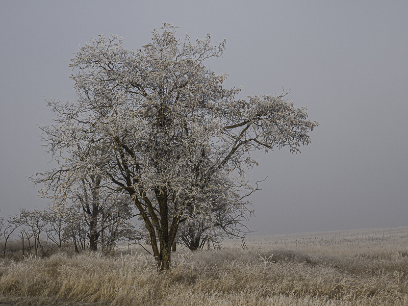
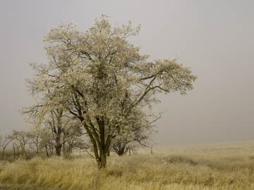
Original digital captureWhat I saw that I liked:A morning of very thick and heavy fog that has frozen into a thick hoarfrost onto everything. Including me. What I don't like in the picture:I set the camera's white balance to "Cloudy" and the above is what I got. Yuck. What I learned:We all know that cameras aren't flawless and that sometimes we need to override the "auto" settings. This is, perhaps, an extreme example. The image at left is what the scene looked like to my human eyes. Needless to say, it took some work in post-processing to convert that yellow mess above into "correct colors" we see in the image at left. I just love the pale, muted blue in the sky. 2nd Chances: What I might try nextThis one is tricky to print. I haven't got a perfect print yet — one that matches the image at left as it appears on my monitor. I'm sneaking up on it, though! |


