Every Picture Is a Compromise
Lessons from the Also-rans
Most photography websites show the photographer's very best work. Wonderful. But that's not the full story of a creative life. If we want to learn, we'd better pay attention to the images that aren't "greatest hits" and see what lessons they have to offer. Every picture is a compromise — the sum of its parts, optical, technical, visual, emotional, and even cosmic – well, maybe not cosmic, but sometimes spiritual. Success on all fronts is rare. It's ok to learn from those that are not our best.
This is a series about my also-rans, some of which I've been able to improve at bit (i.e., "best effort"), none of which I would consider my best. With each there are lessons worth sharing, so I will.
|
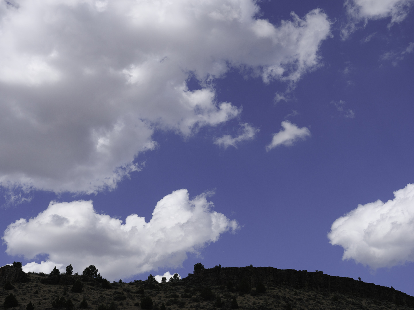
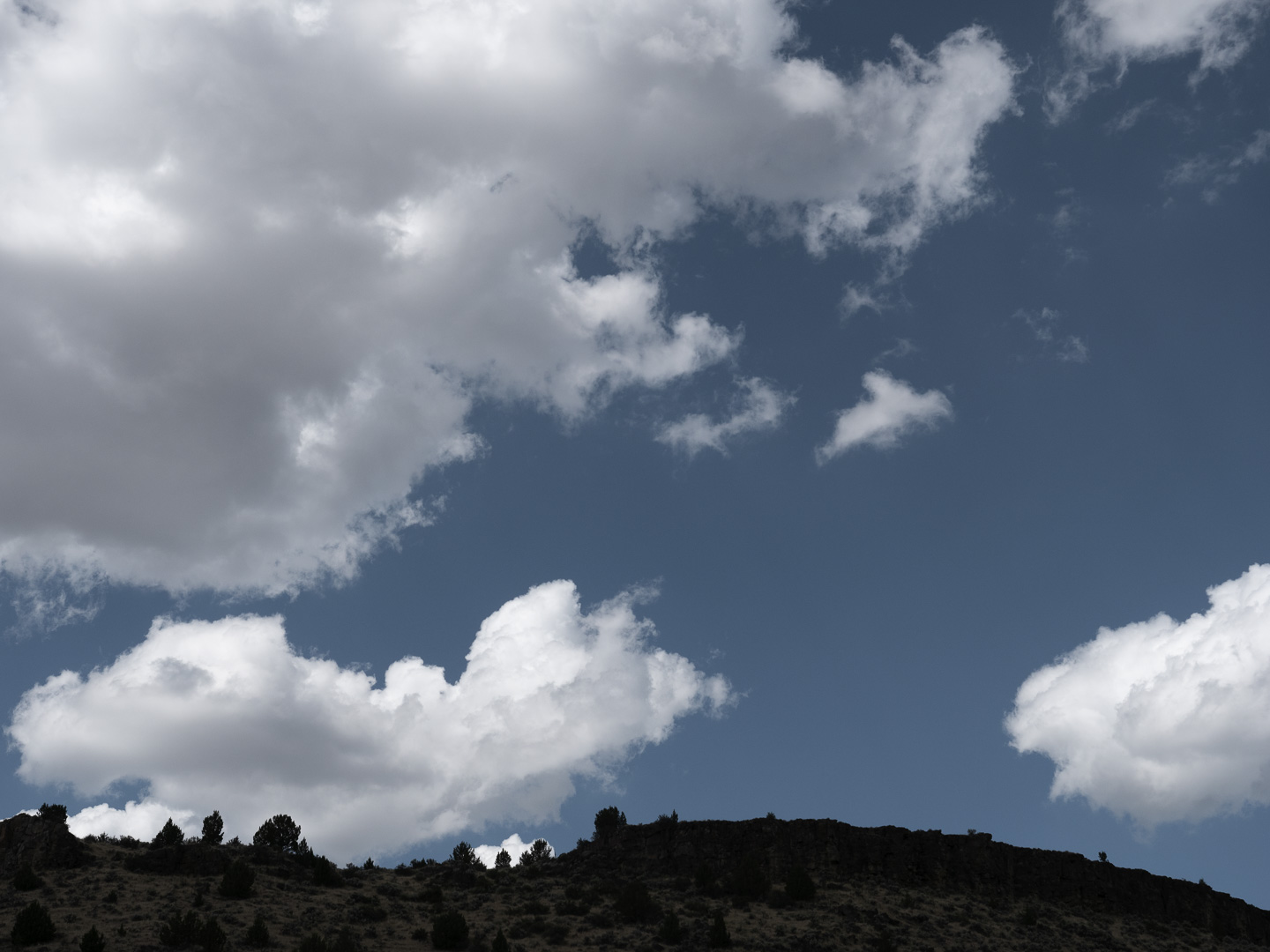
Original digital capture
What I saw that I liked:Lovely clouds in a . . . cyan sky? What I don't like in the picture:Seems like Lightroom wants all my blue skies to be cyan. What's going on here? What I learned:Finally! I figured it out. In Lightroom's Develop module in the Basic tab, one of the first options is the Profile. Turns out the Adobe Color profile is a bit off with Panasonic RAW files. By swithching to a "Camera Standard" profile, all my skies become the blue they should be! Note: this Profile business doesn't change the colors in the RAW file, just the way Lightroom sets the starting point for processing as it interprets the RAW data. The colors that will show up in your pictures or prints will be rendered in the output process. Essentially, the Profile sets the way the image looks as you begin processing, but the actual processing you apply determines the way the image will look in the end. Not sure about other cameras or other brands, but if your colors look off, see if the default Profile is buggering up how your images look before processing. |