Every Picture Is a Compromise
Lessons from the Also-rans
Most photography websites show the photographer's very best work. Wonderful. But that's not the full story of a creative life. If we want to learn, we'd better pay attention to the images that aren't "greatest hits" and see what lessons they have to offer. Every picture is a compromise — the sum of its parts, optical, technical, visual, emotional, and even cosmic – well, maybe not cosmic, but sometimes spiritual. Success on all fronts is rare. It's ok to learn from those that are not our best.
This is a series about my also-rans, some of which I've been able to improve at bit (i.e., "best effort"), none of which I would consider my best. With each there are lessons worth sharing, so I will.
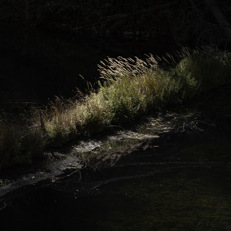
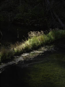
Original digital captureWhat I saw that I liked:Same location as yesterday's image of the solitary pine tree. Same angular morning light. Yay! What I don't like in the picture:Again, lovely beam of sunlight, but the shadows need some fussing. What I learned:It's a lot easier to push shadows down and still preserve detail than it is to pull shadows up and deal with the noise. Not sure why, but of late I've found myself making more and more square format images. I never owned a Hasselblad, but I did have a Mamiya Twin Lens C33 for a while. I know this will have you all throwing tomatoes at me, but my least favorite aspect ratio is 3:2. I know, odd for me to say after all those years with a 2¼ x 3¼ monorail view camera. What can I say? Artists need not be consistent. |


