Every Picture Is a Compromise
Lessons from the Also-rans
Most photography websites show the photographer's very best work. Wonderful. But that's not the full story of a creative life. If we want to learn, we'd better pay attention to the images that aren't "greatest hits" and see what lessons they have to offer. Every picture is a compromise — the sum of its parts, optical, technical, visual, emotional, and even cosmic – well, maybe not cosmic, but sometimes spiritual. Success on all fronts is rare. It's ok to learn from those that are not our best.
This is a series about my also-rans, some of which I've been able to improve at bit (i.e., "best effort"), none of which I would consider my best. With each there are lessons worth sharing, so I will.
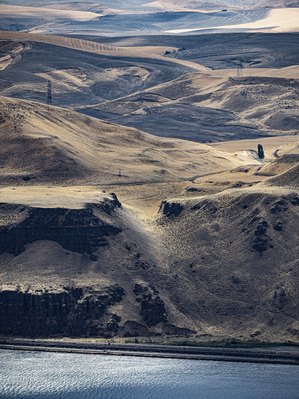
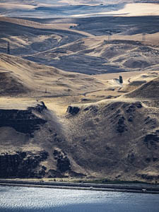
Original digital captureWhat I saw that I liked:Looking down on the Oregon Columbia River Plateau from the Washington side. What I don't like in the picture:This is one of those "spot the differences" puzzle. There is a slight horizonal shift (handheld shot), but that not what I want you to find. Keep looking. What I learned:In the one above, the cars and trucks on the freeway are distracting to my eye. In the one at left, I waited for a moment when I could make the exposure without any traffic on the road. I never did get my wish, but a couple of clones in Lightroom took care of them. It's not that I didn't want vehicles, but rather that I didn't want the distractions of those white vehicles from landscape I was hoping to show. 2nd Chances: What I might try nextI suppose I could crop out the freeway and railroad tracks, but then I'd end up cropping out the river, too. At least I found a scene that had no wind turbines — not and easy thing to do in today's Columbia Gorge. |


