Every Picture Is a Compromise
Lessons from the Also-rans
Most photography websites show the photographer's very best work. Wonderful. But that's not the full story of a creative life. If we want to learn, we'd better pay attention to the images that aren't "greatest hits" and see what lessons they have to offer. Every picture is a compromise — the sum of its parts, optical, technical, visual, emotional, and even cosmic – well, maybe not cosmic, but sometimes spiritual. Success on all fronts is rare. It's ok to learn from those that are not our best.
This is a series about my also-rans, some of which I've been able to improve at bit (i.e., "best effort"), none of which I would consider my best. With each there are lessons worth sharing, so I will.
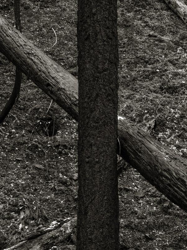
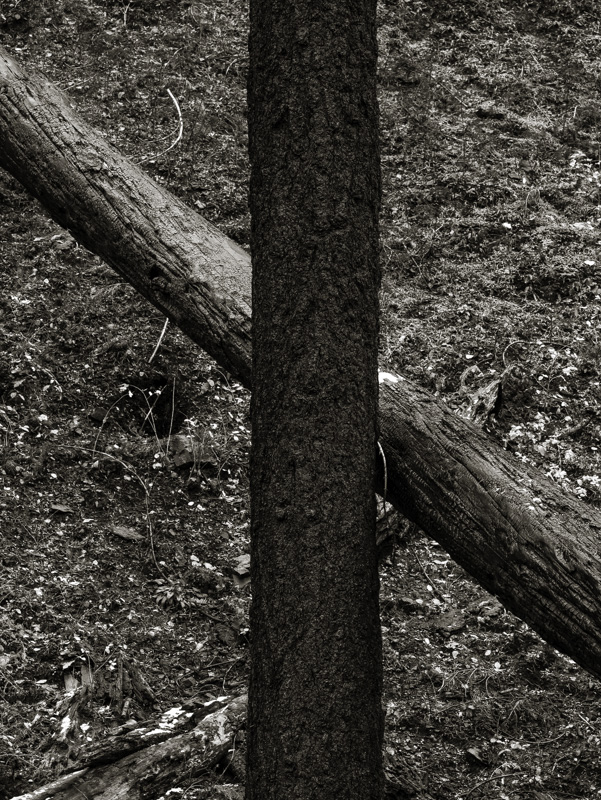
Original digital captureWhat I saw that I liked:A whole bunch of fun tones — dark bark, lighter bark, a touch of snow, a hillside of forest floor. Yay. What I don't like in the picture:The relationship between the two tree trunks is not very "compositional." They need to cross each other more. What I learned:You can see at left what the problem was that led to my original version above. The black limb at the left edge and the log in the upper right are not good. Cloning to the rescue. The image at left below is the finished version with those two troublesome elements removed. Yay. 2nd Chances: What I might try nextI really need to print this one. I'm hoping those deep tones in the dark tree just drink up the light in a print. |


