Every Picture Is a Compromise
Lessons from the Also-rans
Most photography websites show the photographer's very best work. Wonderful. But that's not the full story of a creative life. If we want to learn, we'd better pay attention to the images that aren't "greatest hits" and see what lessons they have to offer. Every picture is a compromise — the sum of its parts, optical, technical, visual, emotional, and even cosmic – well, maybe not cosmic, but sometimes spiritual. Success on all fronts is rare. It's ok to learn from those that are not our best.
This is a series about my also-rans, some of which I've been able to improve at bit (i.e., "best effort"), none of which I would consider my best. With each there are lessons worth sharing, so I will.
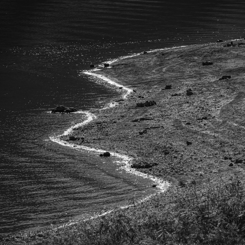
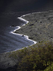
Original digital captureWhat I saw that I liked:I've never met a squiggly shoreline I didn't like. What I don't like in the picture:I wish I had a dollar for every picture of mine that has and out-of-focus plant in the lower corner. I could afford a new lens — or a taller ladder. I think this is one of the manifestations of my 26-inch inseam. I just can see over the nearby vegetation! What I learned:There are two tricks I've learned that sometimes salvage these mistakes. The first is to crop to a square. The second is to merge the vegetation with whatever is behind it by converting to b/w. The example at left isn't a very good photograph, but it illustrates my points. 2nd Chances: What I might try nextWhat if I did a selective color edit by keeping the water blue? |


