Every Picture Is a Compromise
Lessons from the Also-rans
Most photography websites show the photographer's very best work. Wonderful. But that's not the full story of a creative life. If we want to learn, we'd better pay attention to the images that aren't "greatest hits" and see what lessons they have to offer. Every picture is a compromise — the sum of its parts, optical, technical, visual, emotional, and even cosmic – well, maybe not cosmic, but sometimes spiritual. Success on all fronts is rare. It's ok to learn from those that are not our best.
This is a series about my also-rans, some of which I've been able to improve at bit (i.e., "best effort"), none of which I would consider my best. With each there are lessons worth sharing, so I will.
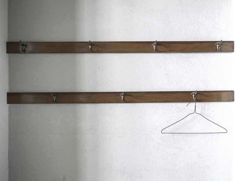
Original digital captureWhat I saw that I liked:I obviously like this subject. Who knows why! What I don't like in the picture:What is the difference between these two nostalgic images? Could it be that the one above is a modern, plastic hanger? Sort of ruins the sense of nostalgia. What I learned:I'm not crazy about either of these. There is an image to be made from this idea, but neither of these are successful — at least not to my eye. So this is a picture I'll keep working on, keep looking for, keep photographing. Maybe I'll end up with a project of hangers? How exciting! Ahem. 2nd Chances: What I might try nextI might like the one at left a little better if there was a more defined right edge. Maybe this needs a linear gradient to bring down the highlights a bit. |


