Every Picture Is a Compromise
Lessons from the Also-rans
Most photography websites show the photographer's very best work. Wonderful. But that's not the full story of a creative life. If we want to learn, we'd better pay attention to the images that aren't "greatest hits" and see what lessons they have to offer. Every picture is a compromise — the sum of its parts, optical, technical, visual, emotional, and even cosmic – well, maybe not cosmic, but sometimes spiritual. Success on all fronts is rare. It's ok to learn from those that are not our best.
This is a series about my also-rans, some of which I've been able to improve at bit (i.e., "best effort"), none of which I would consider my best. With each there are lessons worth sharing, so I will.
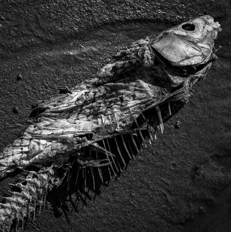
Original digital captureWhat I saw that I liked:I saw details and tones. This is an example from my film days with a view camera — which was an ideal opportunity to use the tilting front standard to keep everything sharp at this downward pointing angle. I miss tilts and swings. What I don't like in the picture:A little flat. To salvage it, I used Grade 5 paper and a high contrast developer for this print. What I learned:I was so happy with this image. I had risen to the technical challenges. With pride I showed it to a photo buddy. He looked at it for a while, thought a minute and said, "You do realize this is a rotting fish carcass, don't you?" I guess no one will want this decorating their living room. But it's got great b/w tonalities, wouldn't you agree? 2nd Chances: What I might try nextThis needs to be an 8-foot print. That'll make it sell! |


