Every Picture Is a Compromise
Lessons from the Also-rans
Most photography websites show the photographer's very best work. Wonderful. But that's not the full story of a creative life. If we want to learn, we'd better pay attention to the images that aren't "greatest hits" and see what lessons they have to offer. Every picture is a compromise — the sum of its parts, optical, technical, visual, emotional, and even cosmic – well, maybe not cosmic, but sometimes spiritual. Success on all fronts is rare. It's ok to learn from those that are not our best.
This is a series about my also-rans, some of which I've been able to improve at bit (i.e., "best effort"), none of which I would consider my best. With each there are lessons worth sharing, so I will.
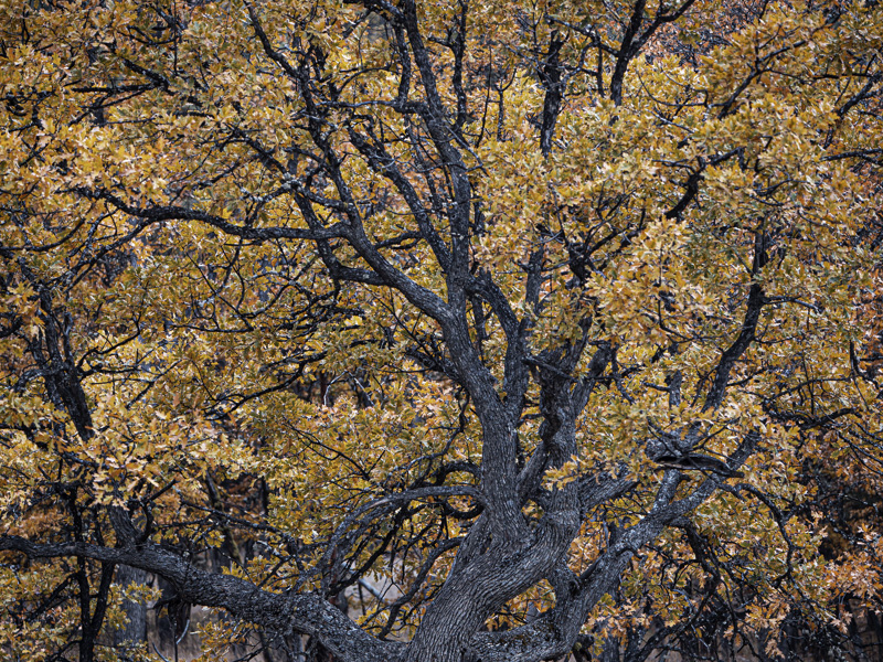
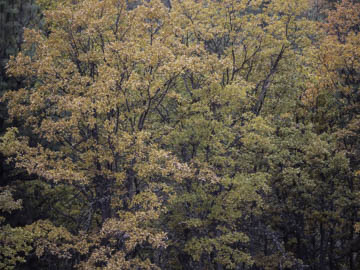
Original digital captureWhat I saw that I liked:Fall colors. What I don't like in the picture:No sense of "composition" whatsoever. What I learned:I've mention my friend, Dave Best, who taught me the habit of walking around my potential subject in order to find the best angle for the composition. In this example, the above image is what I saw that first caught my eye. Walking around this tree, however, showed my the image at left. Thanks, Dave, for the great tip. 2nd Chances: What I might try nextI've never printed this image. I should. |


