Every Picture Is a Compromise
Lessons from the Also-rans
Most photography websites show the photographer's very best work. Wonderful. But that's not the full story of a creative life. If we want to learn, we'd better pay attention to the images that aren't "greatest hits" and see what lessons they have to offer. Every picture is a compromise — the sum of its parts, optical, technical, visual, emotional, and even cosmic – well, maybe not cosmic, but sometimes spiritual. Success on all fronts is rare. It's ok to learn from those that are not our best.
This is a series about my also-rans, some of which I've been able to improve at bit (i.e., "best effort"), none of which I would consider my best. With each there are lessons worth sharing, so I will.
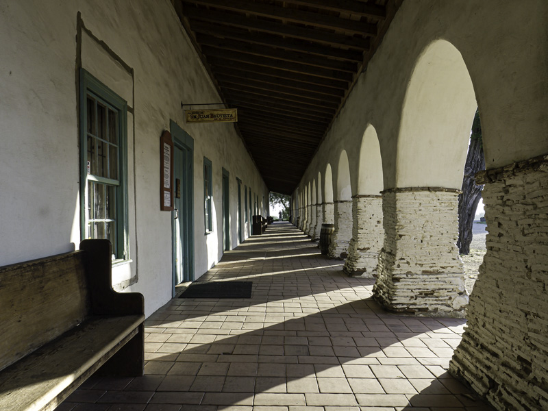
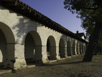
Original digital captureWhat I saw that I liked:San Juan Bautista is a fascinating historical location in central California. What I don't like in the picture:It's not that I don't like the image above, but . . . What I learned:Generalized statements are always subject to exceptions, but I will nonetheless state that generally I prefer photographing from inside to outside (left) rather than outside to inside (above). I wish I had a better example to illustrate this point, but hopefully you can see what I'm proposing. In the above, the shadow area are just blogs of dark. In the image at left, the light areas outside are alive and energized as are the shadows where I am standing. I guess I'd rather deal with the light by holding back the exposure (left) than to deal with the shadows by over-exposing the highlights (above). Dynamic range helps if I need to pull out some detail from the shadows, but those "recovered" shadows just don't have the same sense of living shadows. 2nd Chances: What I might try nextIdeally, I'd like to eliminate those two tourist signs in the image at left. Content-aware fill? |


