Every Picture Is a Compromise
Lessons from the Also-rans
Most photography websites show the photographer's very best work. Wonderful. But that's not the full story of a creative life. If we want to learn, we'd better pay attention to the images that aren't "greatest hits" and see what lessons they have to offer. Every picture is a compromise — the sum of its parts, optical, technical, visual, emotional, and even cosmic – well, maybe not cosmic, but sometimes spiritual. Success on all fronts is rare. It's ok to learn from those that are not our best.
This is a series about my also-rans, some of which I've been able to improve at bit (i.e., "best effort"), none of which I would consider my best. With each there are lessons worth sharing, so I will.
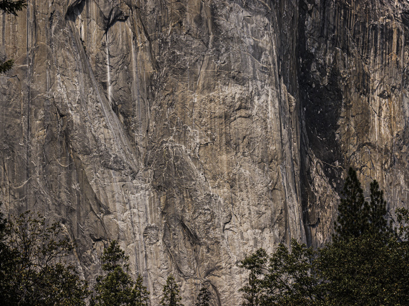
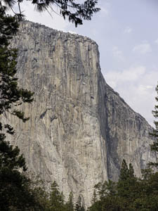
Original digital captureWhat I saw that I liked:El Capitan in Yosemite. Wow. What I don't like in the picture:Every tourist with a camera makes the photograph above. There's a pull-out in the road that make this framing with the trees almost a compulsory shot — and therefore, a yawner. What I learned:Curiously enough, I think including the top of the monolith makes it look smaller in the photograph. The massive wall at the left is much more intimidating and feels more like it looked to me as I stood underneath it. These two images are made from the same spot, a few seconds apart. The one above is everybody's shot; the one at left is a more personally expressive one. 2nd Chances: What I might try nextSure would be fun if there was a rock climber in the one at left to add a sense of scale. |


