Every Picture Is a Compromise
Lessons from the Also-rans
Most photography websites show the photographer's very best work. Wonderful. But that's not the full story of a creative life. If we want to learn, we'd better pay attention to the images that aren't "greatest hits" and see what lessons they have to offer. Every picture is a compromise — the sum of its parts, optical, technical, visual, emotional, and even cosmic – well, maybe not cosmic, but sometimes spiritual. Success on all fronts is rare. It's ok to learn from those that are not our best.
This is a series about my also-rans, some of which I've been able to improve at bit (i.e., "best effort"), none of which I would consider my best. With each there are lessons worth sharing, so I will.
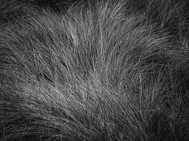
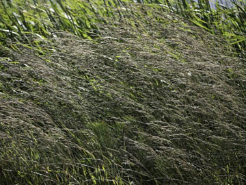
Original digital captureWhat I saw that I liked:There are some subjects that I return to time and time again. Grass patterns, especially if they are blown, are one of these. What I don't like in the picture:The above is too much of a good thing. Too much chaos left, too linear, too "uncomposed." What I learned:Compare the one above (which sucks) to the one at left. To my eye, the one at left has just enough order in the chaos to make it interesting. It ain't Clearing Winter Storm, but I would be happy to spend time looking that swoosh of grass for at least a few minutes. 2nd Chances: What I might try nextThis is untoned. It probably should be. Maybe. |


