Every Picture Is a Compromise
Lessons from the Also-rans
Most photography websites show the photographer's very best work. Wonderful. But that's not the full story of a creative life. If we want to learn, we'd better pay attention to the images that aren't "greatest hits" and see what lessons they have to offer. Every picture is a compromise — the sum of its parts, optical, technical, visual, emotional, and even cosmic – well, maybe not cosmic, but sometimes spiritual. Success on all fronts is rare. It's ok to learn from those that are not our best.
This is a series about my also-rans, some of which I've been able to improve at bit (i.e., "best effort"), none of which I would consider my best. With each there are lessons worth sharing, so I will.
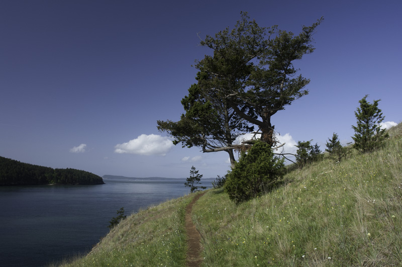
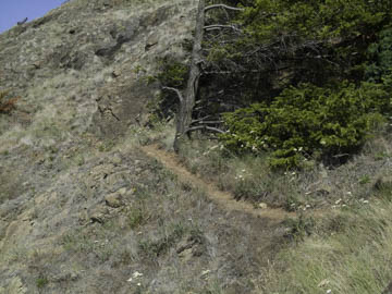
Original digital captureWhat I saw that I liked:I was hiking this path along the side of the island that sloped into the sea. The path was so fun and beautiful that I just had to photograph it. What I don't like in the picture:The abomination that is the first attempt above is just embarrassing. What I learned:Show the context. Even though the image at left has a tiny percentage of the square millimeters of the image that are the path, there is no question that it dominates the eye. All the rest of the image is context for those few millimeters that are the path. The main subject doesn't always have to be the largest thing in the picture, and the subordinate subjects don't have to be tucked away in the background or the periphery. |


