Every Picture Is a Compromise
Lessons from the Also-rans
Most photography websites show the photographer's very best work. Wonderful. But that's not the full story of a creative life. If we want to learn, we'd better pay attention to the images that aren't "greatest hits" and see what lessons they have to offer. Every picture is a compromise — the sum of its parts, optical, technical, visual, emotional, and even cosmic – well, maybe not cosmic, but sometimes spiritual. Success on all fronts is rare. It's ok to learn from those that are not our best.
This is a series about my also-rans, some of which I've been able to improve at bit (i.e., "best effort"), none of which I would consider my best. With each there are lessons worth sharing, so I will.
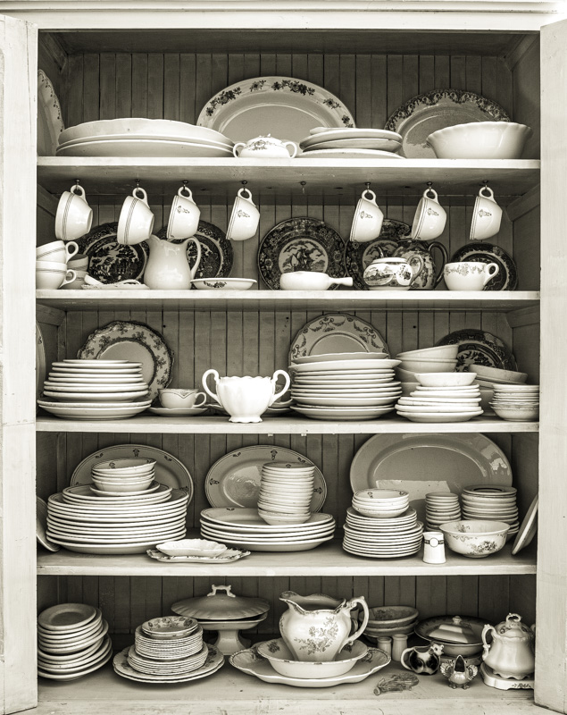
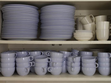
Original digital captureWhat I saw that I liked:Something extremely domesitc and nostalgic in an open cupboard filled with plates. What I don't like in the picture:The one above just doesn't work. I've never quite been able to put my finger on it, but it's just not right. What I learned:The one at left (made years later) was my second attempt at this subject and for some reason I find it much more satisfying. Is it the variety? I don't think so. I'm more inclined to think it has something to do with the 5 shevles versus just two shelves in the version above. It could be the layers of plates behind plates that makes the difference. Or the sheen off the china. Or maybe all the above. |


