Every Picture Is a Compromise
Lessons from the Also-rans
Most photography websites show the photographer's very best work. Wonderful. But that's not the full story of a creative life. If we want to learn, we'd better pay attention to the images that aren't "greatest hits" and see what lessons they have to offer. Every picture is a compromise — the sum of its parts, optical, technical, visual, emotional, and even cosmic – well, maybe not cosmic, but sometimes spiritual. Success on all fronts is rare. It's ok to learn from those that are not our best.
This is a series about my also-rans, some of which I've been able to improve at bit (i.e., "best effort"), none of which I would consider my best. With each there are lessons worth sharing, so I will.
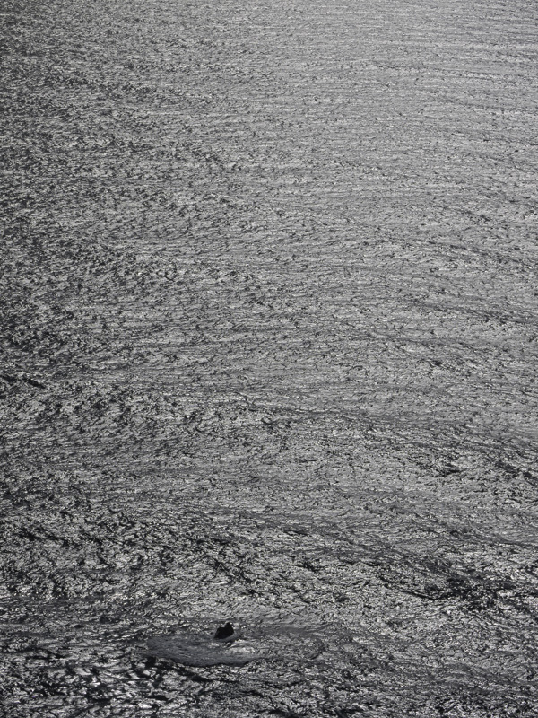
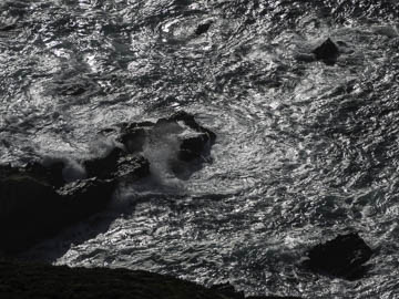
Original digital captureEmpty Centers Week Resisting "bull's eye" composition. What I saw that I liked:It's always lovely to have a chance to photograph the ocean — the vast, vast ocean. What I don't like in the picture:The picture above is not really of "the ocean" but rather about the shoreline. Notice that the rocky point is right in the center of the image and therefore is the focus of attention. I realized I wanted to say something about the vastness of the ocean as I was seeing it from this bluff a few hundred feet above the sea. The one above doesn't say "vastness" at all. Not a bad photograph, but not really what I wanted to portray. What I learned:The one at left is as "empty" a center as a photograph can get. Most of the photograph is empty! Perfect, exactly what I wanted to communicate about the vastness of the ocean. By including the one small rock in the lower left, that encourages our eye to zero in on it, then drift upward through the vastness of seeminlgy endless waves. Bingo. In this example, the empty geometric center is the point of the photograph. |


