Every Picture Is a Compromise
Lessons from the Also-rans
Most photography websites show the photographer's very best work. Wonderful. But that's not the full story of a creative life. If we want to learn, we'd better pay attention to the images that aren't "greatest hits" and see what lessons they have to offer. Every picture is a compromise — the sum of its parts, optical, technical, visual, emotional, and even cosmic – well, maybe not cosmic, but sometimes spiritual. Success on all fronts is rare. It's ok to learn from those that are not our best.
This is a series about my also-rans, some of which I've been able to improve at bit (i.e., "best effort"), none of which I would consider my best. With each there are lessons worth sharing, so I will.
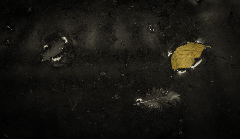
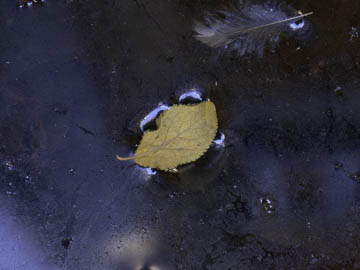
Original digital captureEmpty Centers Week Resisting "bull's eye" composition. What I saw that I liked:Floating leaf on a scummy puddle. What I don't like in the picture:The one above was my first and knee-jerk reaction to this scene. When what you like is a "floating leaf on a scummy puddle," it's easy to simply place that leaf in the center of the frame. It's a way of hitting your viewer with cudgel that says, "look at this, [stupid]!" But once the viewer looks at the leaf, there's nowhere to go. Maybe the feather, but it's not much of a subject compared to that overpowering leaf in the dead center. What I learned:The geometric center of a photograph is the least important location. In fact, it's pretty universal that leaving the center empty is a good strategy. In the image at left, the three objects create a triangle that allows the eye to circle the scene. By doing so, it's much more interesting as a photograph. |


