Every Picture Is a Compromise
Lessons from the Also-rans
Most photography websites show the photographer's very best work. Wonderful. But that's not the full story of a creative life. If we want to learn, we'd better pay attention to the images that aren't "greatest hits" and see what lessons they have to offer. Every picture is a compromise — the sum of its parts, optical, technical, visual, emotional, and even cosmic – well, maybe not cosmic, but sometimes spiritual. Success on all fronts is rare. It's ok to learn from those that are not our best.
This is a series about my also-rans, some of which I've been able to improve at bit (i.e., "best effort"), none of which I would consider my best. With each there are lessons worth sharing, so I will.
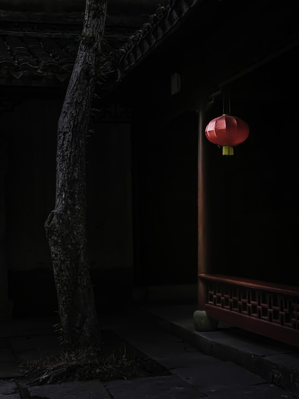
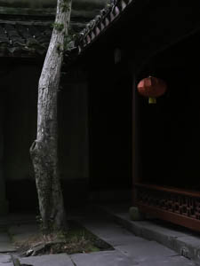
Original digital captureExtreme Salvage Week Images where something was made from practically nothing. What I saw that I liked:The subject is nice, but the lighting is all wrong. What I don't like in the picture:The visually dominant object in the original capture is the tree, not the red lantern. This is where we go to work to make the light we wish would have been there. What I learned:One change begets another which begets another, rinse and repeat. Afte I had darkened the tree, I realized I needed to darken the sidewalk, too. Then I lightened the red lantern but it looked fake until I realized I needed to lighten the red post behind it. Look, adjust. Look, adjust. Look adjust. Whatever you do, just don't stop too soon. It's like peeling an onion. Perhaps I could sum this up with the phrase, "It's not what you take, it's what you make that really counts." Hmmm... |


