Every Picture Is a Compromise
Lessons from the Also-rans
Most photography websites show the photographer's very best work. Wonderful. But that's not the full story of a creative life. If we want to learn, we'd better pay attention to the images that aren't "greatest hits" and see what lessons they have to offer. Every picture is a compromise — the sum of its parts, optical, technical, visual, emotional, and even cosmic – well, maybe not cosmic, but sometimes spiritual. Success on all fronts is rare. It's ok to learn from those that are not our best.
This is a series about my also-rans, some of which I've been able to improve at bit (i.e., "best effort"), none of which I would consider my best. With each there are lessons worth sharing, so I will.
|
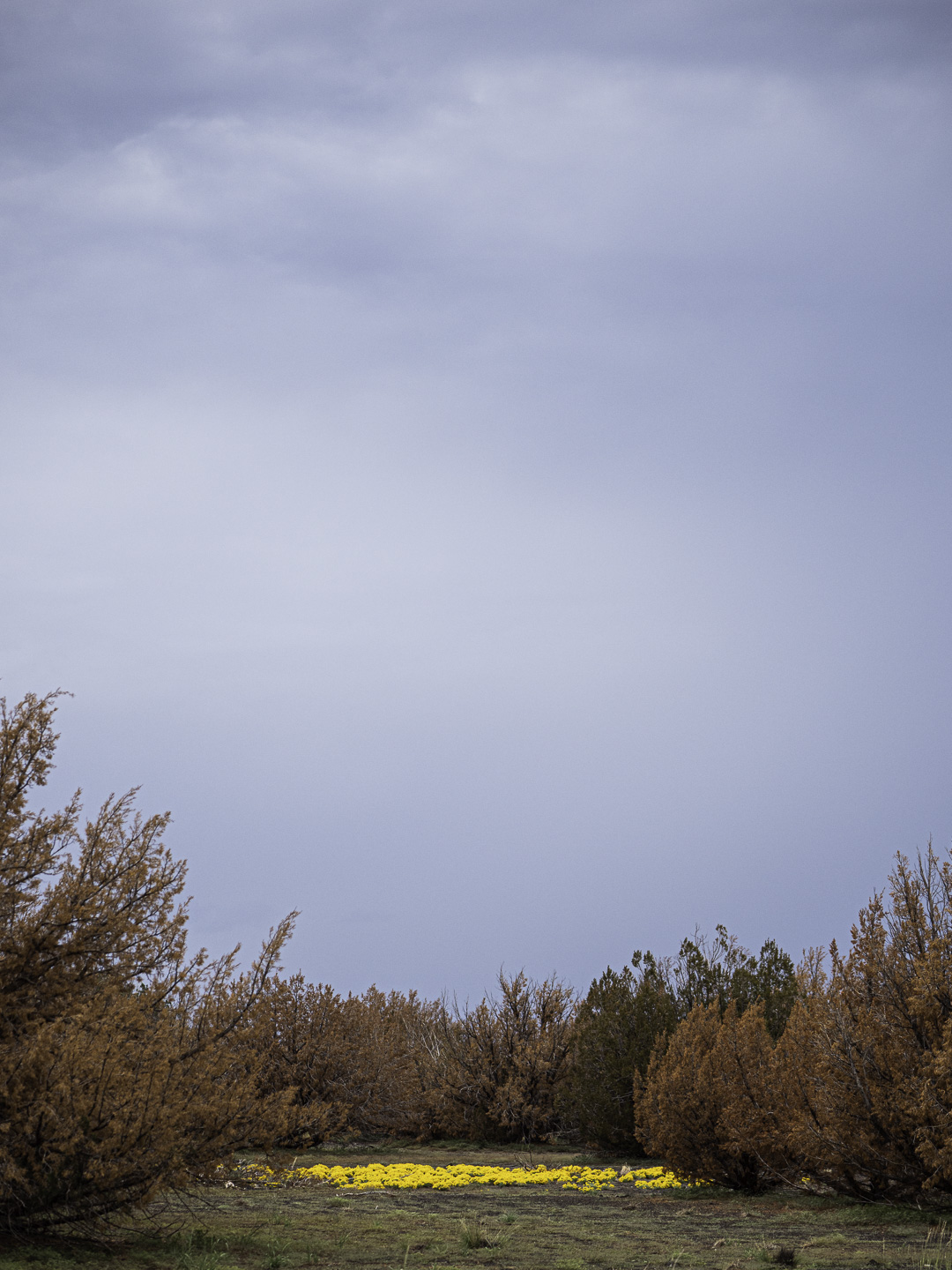
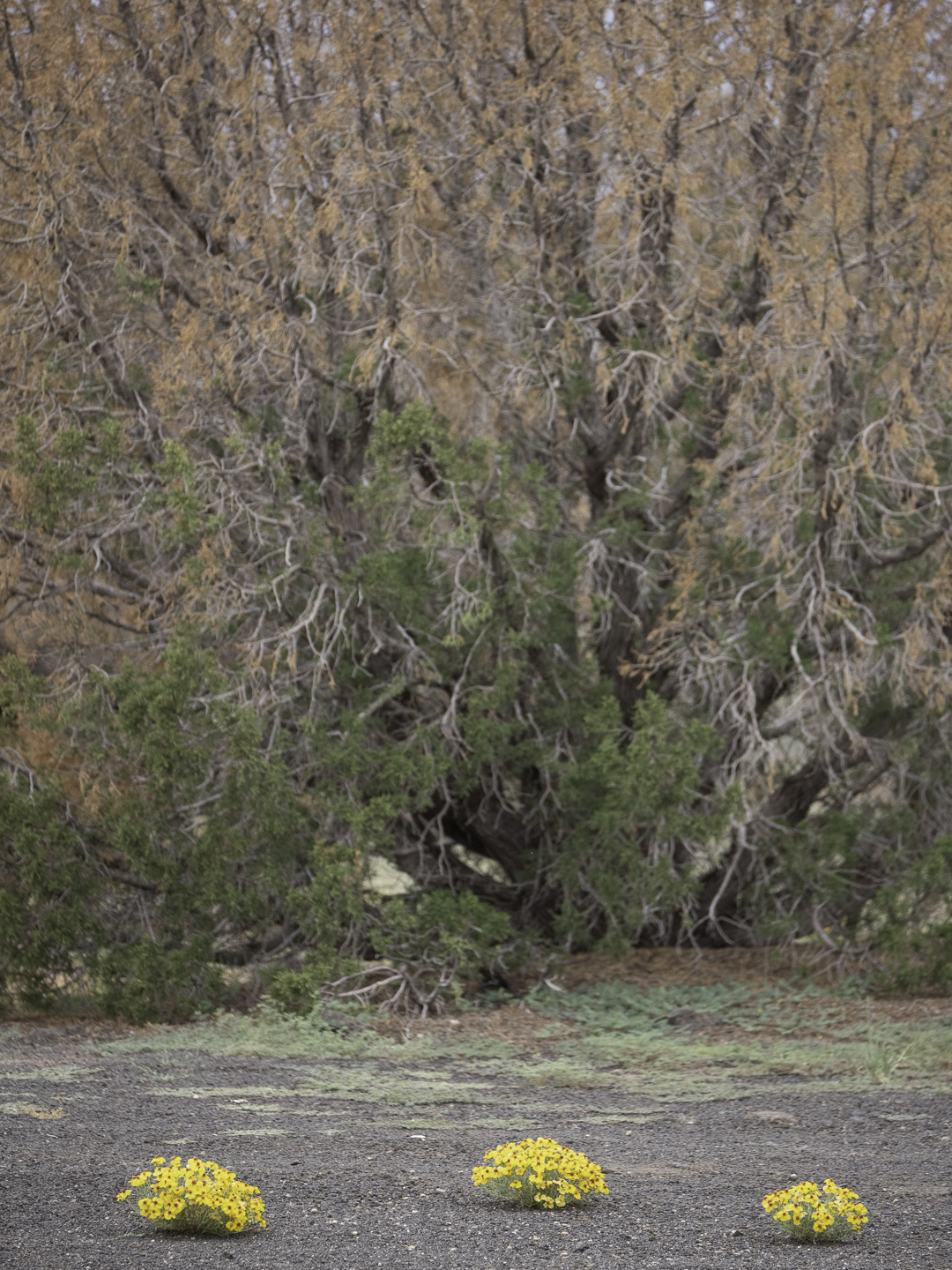
Original digital capture
What I saw that I liked:I knew there was something I wanted to do with this little splash of color in the desert. What I don't like in the picture:The one above was my first attempt. Meh. What I learned:With a shot like this where the splash of color is the photograph, that color needs to be seen in stark contrast to its surrounding subjects. In the above, the yellow blossoms are seen against a sort of brownish orange and dark green. In the one at right, the splash of yellow is countered by all that blue sky. I like that one much better. Not a fantastic photograph, but a better job of saying, "YELLOW!!!" 2nd Chances: What I might try nextMaybe with some precise color masking, I might be able to desaturate the orange in the trees a bit — not too much, but just push them a bit toward gray. |