Every Picture Is a Compromise
Lessons from the Also-rans
Most photography websites show the photographer's very best work. Wonderful. But that's not the full story of a creative life. If we want to learn, we'd better pay attention to the images that aren't "greatest hits" and see what lessons they have to offer. Every picture is a compromise — the sum of its parts, optical, technical, visual, emotional, and even cosmic – well, maybe not cosmic, but sometimes spiritual. Success on all fronts is rare. It's ok to learn from those that are not our best.
This is a series about my also-rans, some of which I've been able to improve at bit (i.e., "best effort"), none of which I would consider my best. With each there are lessons worth sharing, so I will.
|
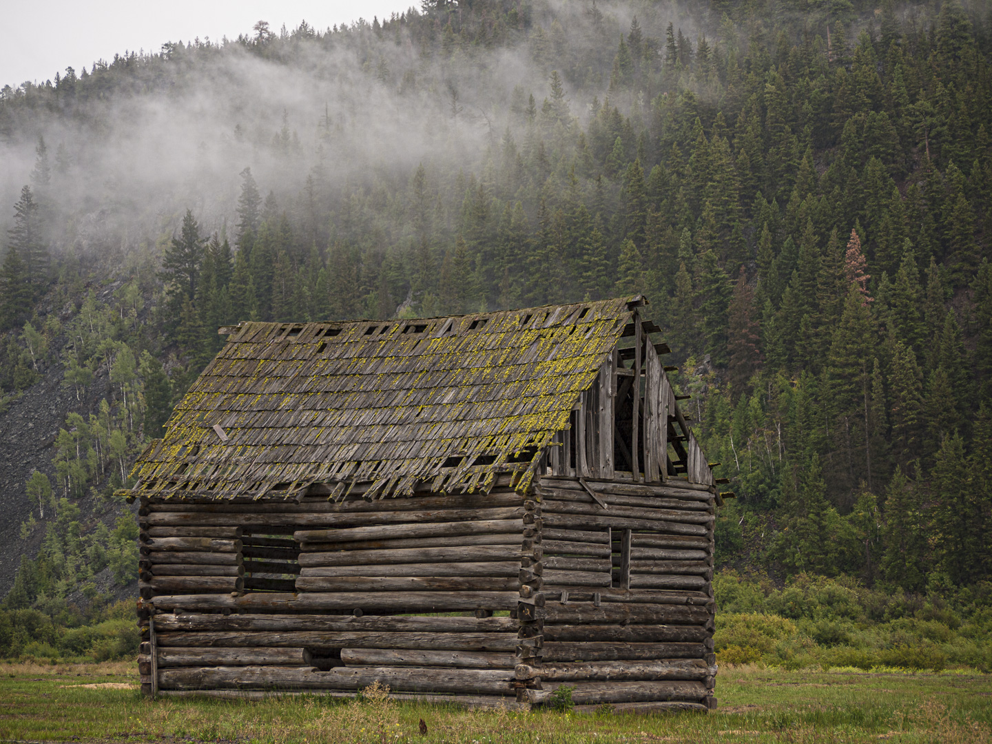
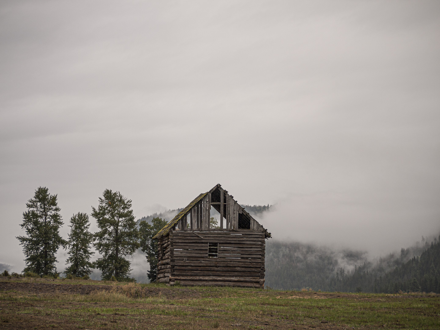
Original digital capture
What I saw that I liked:Quintessential British Columbia on a misty fall day. What I learned:Every square millimeter (Canadian, eh?) of an image either adds to the content or distracts from the content. In the one above, there's a lot of square millimeters that are devoted to sky — wintery, cloudy, foggy sky. But is all that really necessary? Am I wasting space that could be used for something that adds to the content? A shift of position of a couple dozen meters (Canadian, eh?) to the left and I was able to bring the hillside of trees into play. the mist is still there, so we still feel the foggy fall upon us, but the trees add a sense that we are in a valley or at least at the base of a hill. 2nd Chances: What I might try nextAll thos square millimeters in the upper left corner are wasted. Should I crop that out? |