Every Picture Is a Compromise
Lessons from the Also-rans
Most photography websites show the photographer's very best work. Wonderful. But that's not the full story of a creative life. If we want to learn, we'd better pay attention to the images that aren't "greatest hits" and see what lessons they have to offer. Every picture is a compromise — the sum of its parts, optical, technical, visual, emotional, and even cosmic – well, maybe not cosmic, but sometimes spiritual. Success on all fronts is rare. It's ok to learn from those that are not our best.
This is a series about my also-rans, some of which I've been able to improve at bit (i.e., "best effort"), none of which I would consider my best. With each there are lessons worth sharing, so I will.
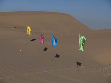
Original digital captureWhat I saw that I liked:A fun image, but out of context how can you tell what it is? Sort of reminds me of flags on the moon, but I don't recall hearing that the Chinese have landed on the moon. Huh? What I don't like in the picture:Without context, a picture is often easily misinterpreted. This can be good, if that is your intent. Otherwise, it's just confusing. What I learned:This was photographed in the Gobi Desert in China on a mid-winter sunny day. The one a left was a few minutes later and also lacks any sense of context — on size. This yurt structure is large enough that it contains a full-size soccer field inside it. 2nd Chances: What I might try nextSince both of these fail the context discussion, I wonder how I could use that creatively in a project? Why fight it when I might be able to go with it and have some fun! |


