Every Picture Is a Compromise
Lessons from the Also-rans
Most photography websites show the photographer's very best work. Wonderful. But that's not the full story of a creative life. If we want to learn, we'd better pay attention to the images that aren't "greatest hits" and see what lessons they have to offer. Every picture is a compromise — the sum of its parts, optical, technical, visual, emotional, and even cosmic – well, maybe not cosmic, but sometimes spiritual. Success on all fronts is rare. It's ok to learn from those that are not our best.
This is a series about my also-rans, some of which I've been able to improve at bit (i.e., "best effort"), none of which I would consider my best. With each there are lessons worth sharing, so I will.
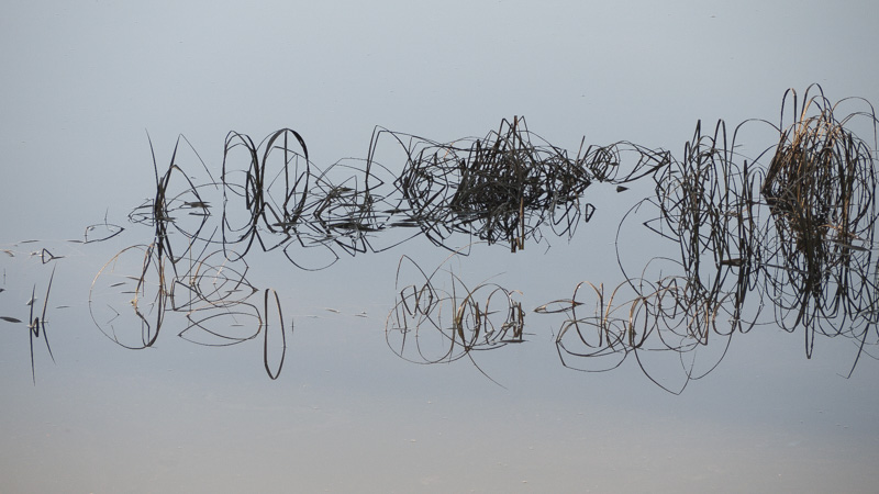
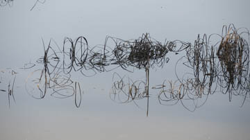
Original digital captureWhat I saw that I liked:Quiet, simple. What I don't like in the picture:Junk in the upper left has got to go. What I learned:So I cloned out the junk in the upper left and some of the junk in the water, too. Still not right. What is it that is wrong? I stared at this for a long time and then it hit me — that long vertical in the center. A bit more work with the clone tool, and it's better. Not great, but the challenge of cleaning it up was fun. 2nd Chances: What I might try nextStill haven't used this image anywhere. Maybe it needs a bit more work? I don't know. Just doesn't thrill me. |


