Every Picture Is a Compromise
Lessons from the Also-rans
Most photography websites show the photographer's very best work. Wonderful. But that's not the full story of a creative life. If we want to learn, we'd better pay attention to the images that aren't "greatest hits" and see what lessons they have to offer. Every picture is a compromise — the sum of its parts, optical, technical, visual, emotional, and even cosmic – well, maybe not cosmic, but sometimes spiritual. Success on all fronts is rare. It's ok to learn from those that are not our best.
This is a series about my also-rans, some of which I've been able to improve at bit (i.e., "best effort"), none of which I would consider my best. With each there are lessons worth sharing, so I will.
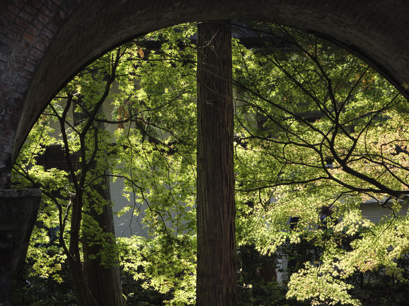
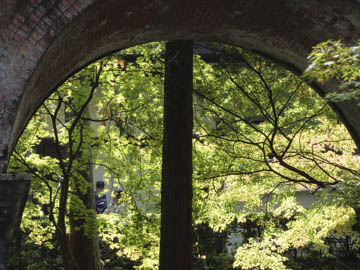
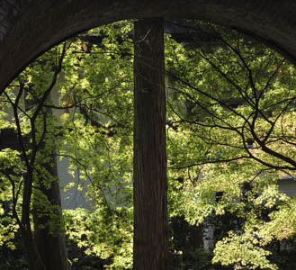
Original digital captureWhat I saw that I liked:I think I had a good idea here — maybe. What I don't like in the picture:I was concentrating so much on the arch that I didn't see the people in the background nor that brightly lit branch poking in from the upper right. What I learned:Fortunately, I chimped, saw the branch (but not the people) and move a bit for the composition at left. 2nd Chances: What I might try nextThe whole left edge of this one still bothers me. Cropping? Darkening? Cloning? To be honest, I'm just not sure it's worth more effort, but then again . . . ? |


