Every Picture Is a Compromise
Lessons from the Also-rans
Most photography websites show the photographer's very best work. Wonderful. But that's not the full story of a creative life. If we want to learn, we'd better pay attention to the images that aren't "greatest hits" and see what lessons they have to offer. Every picture is a compromise — the sum of its parts, optical, technical, visual, emotional, and even cosmic – well, maybe not cosmic, but sometimes spiritual. Success on all fronts is rare. It's ok to learn from those that are not our best.
This is a series about my also-rans, some of which I've been able to improve at bit (i.e., "best effort"), none of which I would consider my best. With each there are lessons worth sharing, so I will.
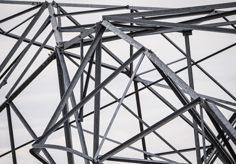
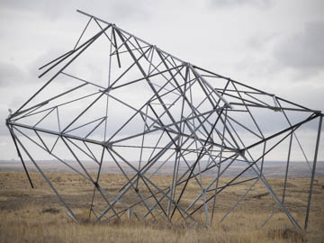
Original digital captureWhat I saw that I liked:A fallen powerline tower. Lots of geometry! What I don't like in the picture:Yuck, yuck, and more yuck. I worked this thing for abougt 45 minutes and the best I got was that yuck to the left. If that's the best, I'll let your imagination conjur up the rest. Yuck. What I learned:Maybe composing in this chaos is easy for some, but I clearly prefer curves and natural shapes over straight lines. I suppose this is a good to know. Seems I need to work harder or learning something useful about how to work with these kinds of angles. Always good to know our weaknesses. 2nd Chances: What I might try nextLess stuff? That is, simplify and move in? Extreme wide angle lens and a very close distance? I know where this is and can get back there fairly easily. Someday, I will. Hope they are still there. |


