Every Picture Is a Compromise
Lessons from the Also-rans
Most photography websites show the photographer's very best work. Wonderful. But that's not the full story of a creative life. If we want to learn, we'd better pay attention to the images that aren't "greatest hits" and see what lessons they have to offer. Every picture is a compromise — the sum of its parts, optical, technical, visual, emotional, and even cosmic – well, maybe not cosmic, but sometimes spiritual. Success on all fronts is rare. It's ok to learn from those that are not our best.
This is a series about my also-rans, some of which I've been able to improve at bit (i.e., "best effort"), none of which I would consider my best. With each there are lessons worth sharing, so I will.
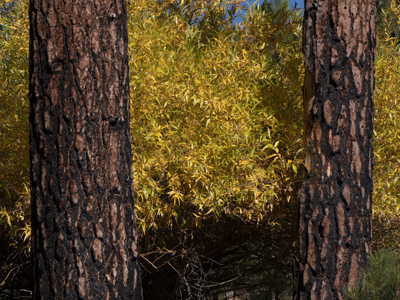
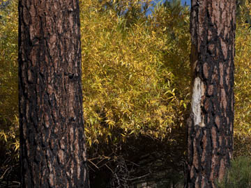
Original digital captureWhat I saw that I liked:The juxtaposition of the yellow leaves and the Ponderosa pine bark. What I don't like in the picture:I preach about this damned stuff, but I still get bit by it. I swear — at the time, I didn't see that giant gash in the bark on the tree to the right! How could I have possibly missed it? Of course, once I saw it on-screen, that gash is all I can see. Duh. What I learned:Even cloning out an obvious mistake won't salvage a bad job of composing. This one just really sucks for so many reasons. 2nd Chances: What I might try nextI did try cropping closer and that didn't work either. Move on, nothing to see here. |


