Every Picture Is a Compromise
Lessons from the Also-rans
Most photography websites show the photographer's very best work. Wonderful. But that's not the full story of a creative life. If we want to learn, we'd better pay attention to the images that aren't "greatest hits" and see what lessons they have to offer. Every picture is a compromise — the sum of its parts, optical, technical, visual, emotional, and even cosmic – well, maybe not cosmic, but sometimes spiritual. Success on all fronts is rare. It's ok to learn from those that are not our best.
This is a series about my also-rans, some of which I've been able to improve at bit (i.e., "best effort"), none of which I would consider my best. With each there are lessons worth sharing, so I will.
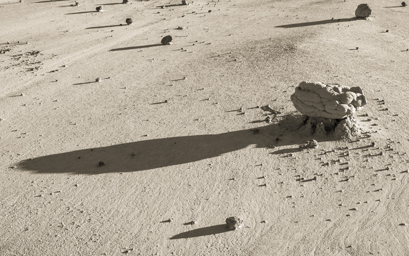
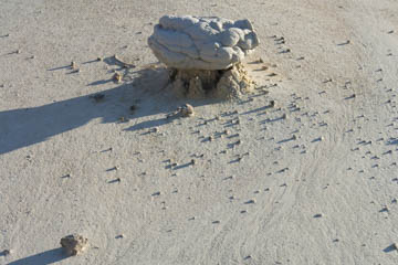
Original digital captureWhat I saw that I liked:The way this rock seems to float a bit above the surface was what originally caught my eye. What I don't like in the picture:The left edge of the image cuts off that shadow in an unpleasing way. I do like the swirl pattern in the dirt to the right of the main rock, but it's too subtle to overcome the incomplete shadow. What I learned:With a slight repositioning and composition, I was able to get more rocks with their shadows and suddenly the repeating shadows make the image. The first attempt was about the rock; the revised composition is about the sun and shadows. I like this one a lot more. 2nd Chances: What I might try nextThis was "finished" before Adobe introduced the new "texture" slider in Lightroom. I'd like to see if that adds an even more tactile sense to the dirt. |


