Every Picture Is a Compromise
Lessons from the Also-rans
Most photography websites show the photographer's very best work. Wonderful. But that's not the full story of a creative life. If we want to learn, we'd better pay attention to the images that aren't "greatest hits" and see what lessons they have to offer. Every picture is a compromise — the sum of its parts, optical, technical, visual, emotional, and even cosmic – well, maybe not cosmic, but sometimes spiritual. Success on all fronts is rare. It's ok to learn from those that are not our best.
This is a series about my also-rans, some of which I've been able to improve at bit (i.e., "best effort"), none of which I would consider my best. With each there are lessons worth sharing, so I will.
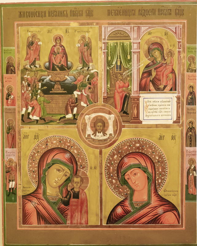
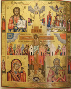
Original digital captureWhat I saw that I liked:I love borrowing ideas from other art disciplines. Here are a couple of examples of Russian icons that I photographed at the Maryhill Museum. What I propose:[True confession: I haven't done this.] I would propose that there are some fascinating layout ideas we could borrow from these icons. It would be easy to do with digital tools. Look carefully at the one at the left. There are four main boxes that each could be a photograph, then a circle in the middle that ties them all together, then another four down the left side and four down the right side that are all vertical panoramas. There are books of these icons that have all kinds of layouts. Could be fun! Years ago I thought a series that would replace these Christian icons with icons I make about other types of faith. There could be one all about science, another all about nature, another all about sex, another all about cars. The list is endless. No, I haven't done anything with this idea. Wish I had. Now I share it with you. Feel free to use it without guilt. I offer this idea as a gift for those of you who are adventurous. |


