Every Picture Is a Compromise
Lessons from the Also-rans
Most photography websites show the photographer's very best work. Wonderful. But that's not the full story of a creative life. If we want to learn, we'd better pay attention to the images that aren't "greatest hits" and see what lessons they have to offer. Every picture is a compromise — the sum of its parts, optical, technical, visual, emotional, and even cosmic – well, maybe not cosmic, but sometimes spiritual. Success on all fronts is rare. It's ok to learn from those that are not our best.
This is a series about my also-rans, some of which I've been able to improve at bit (i.e., "best effort"), none of which I would consider my best. With each there are lessons worth sharing, so I will.
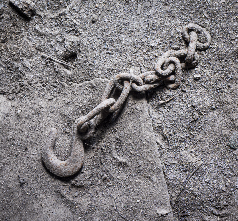
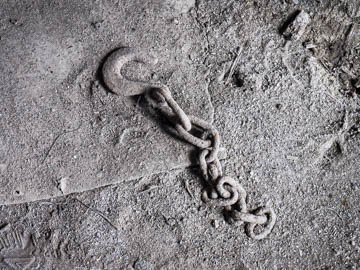
Original digital captureWhat I saw that I liked:Grit, grittier, grittiest. What I don't like in the picture:The one above is the correct orientation for how I found it and exactly how it looked as I pointed my camera down to photograph it. But something is not right. It looks upside down! That's because the light was coming in through a low door in the side of the barn, hence the shadows above the chain. What I learned:I rotated it 90-degrees and to my eye this looks right — shadows under the chain. Optical illusion. In my way of thinking, it's more imporant that the image looks right than that is in the "correct" orientation. 2nd Chances: What I might try nextNeeds to be b/w. |


