Every Picture Is a Compromise
Lessons from the Also-rans
Most photography websites show the photographer's very best work. Wonderful. But that's not the full story of a creative life. If we want to learn, we'd better pay attention to the images that aren't "greatest hits" and see what lessons they have to offer. Every picture is a compromise — the sum of its parts, optical, technical, visual, emotional, and even cosmic – well, maybe not cosmic, but sometimes spiritual. Success on all fronts is rare. It's ok to learn from those that are not our best.
This is a series about my also-rans, some of which I've been able to improve at bit (i.e., "best effort"), none of which I would consider my best. With each there are lessons worth sharing, so I will.
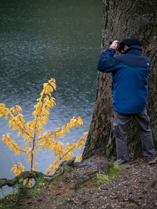
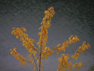
Original digital captureWhat I saw that I liked:What's not to like in a display of fall leaves? What I don't like in the picture:First, why did I leave that pine branch in the lower right corner. Why oh why? Second, this is a dumb picture that doesn't include any kind of relationship. Not that all photos have to display a relationship, but if they don't it's pretty easy for them to become simply, "Here's a pretty thing." Boring. What I learned:I decided to emphasize the relationship to the large tree trunck to the right — just as my friend Joe Lipka stepped into my composition. Thanks, Joe, you saved me from making another boring photograph. Like the coat! Guaranteed his picture is better than either of mine. 2nd Chances: What I might try nextI predict in the art world of fine art photography, this one will not be a big seller. |


