Every Picture Is a Compromise
Lessons from the Also-rans
Most photography websites show the photographer's very best work. Wonderful. But that's not the full story of a creative life. If we want to learn, we'd better pay attention to the images that aren't "greatest hits" and see what lessons they have to offer. Every picture is a compromise — the sum of its parts, optical, technical, visual, emotional, and even cosmic – well, maybe not cosmic, but sometimes spiritual. Success on all fronts is rare. It's ok to learn from those that are not our best.
This is a series about my also-rans, some of which I've been able to improve at bit (i.e., "best effort"), none of which I would consider my best. With each there are lessons worth sharing, so I will.
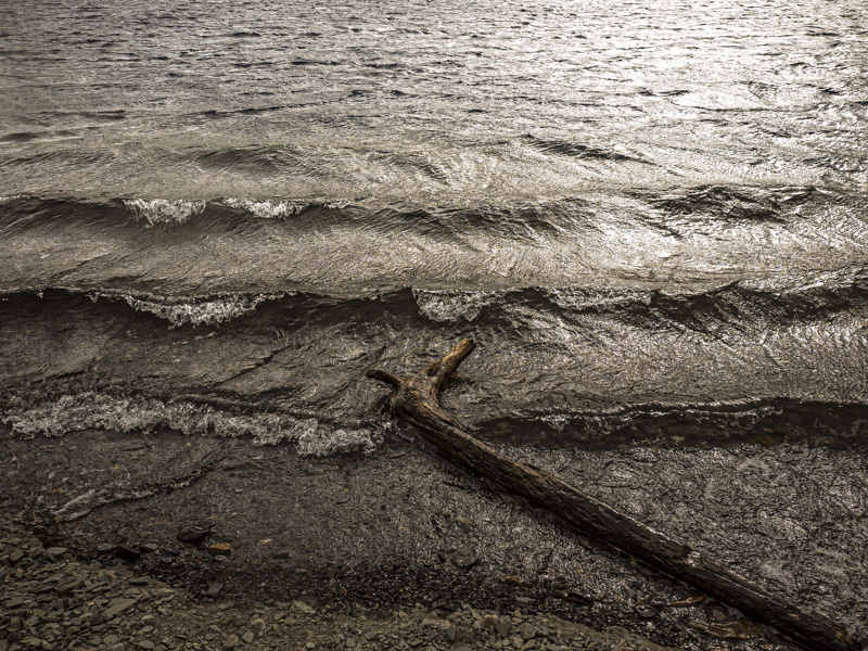
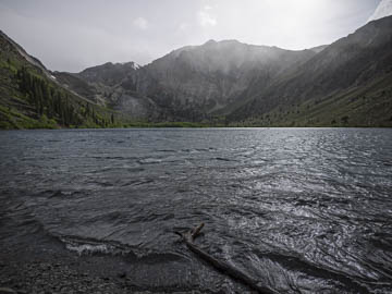
Original digital captureWhat I saw that I liked:The first attempt (above) should have worked. It followed all the "rules" — mist, hills, textured waves, it even has a bird in the distance. What I don't like in the picture:It still sucks. Maybe the horizon line in the dead center? Maybe the lack of dramatic light? Maybe an entire series of poor choices by the photographer? What I learned:Sometimes you just know. The instant I clicked the shutter on the one above, I knew it wasn't going to work. I decided to try one with just the stump and textured waves. Better, but not by much. 2nd Chances: What I might try nextI remember being cold and hungry. It was very windy and I wasn't having fun. Guess this is what happens when you try to force a picture instead of having a snack, taking a nap, and letting it come to you when you are feeling more energized. |


