Every Picture Is a Compromise
Lessons from the Also-rans
Most photography websites show the photographer's very best work. Wonderful. But that's not the full story of a creative life. If we want to learn, we'd better pay attention to the images that aren't "greatest hits" and see what lessons they have to offer. Every picture is a compromise — the sum of its parts, optical, technical, visual, emotional, and even cosmic – well, maybe not cosmic, but sometimes spiritual. Success on all fronts is rare. It's ok to learn from those that are not our best.
This is a series about my also-rans, some of which I've been able to improve at bit (i.e., "best effort"), none of which I would consider my best. With each there are lessons worth sharing, so I will.
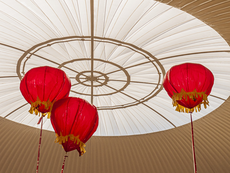
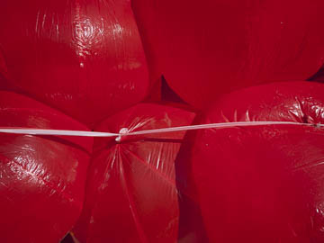
Original digital captureWhat I saw that I liked:Giant red balloons are such a Chinese thing. The one above is ok-. Sort of an abstract, but maybe still balloony. What I don't like in the picture:In particular, it doesn't show at all that they are floating balloons that are filled with helium. What I learned:The one at left at least show them floating in the air, but is that enough? Perhaps it rises to ok+, but not any better than that. Certainly not a 5-star or even close to it. This is the kind of image that might fit in a project with 20 images or so, but it's never going to get a chance to fly solo. (Yes, pun fully intended.) 2nd Chances: What I might try nextI'm stumped. Any ideas? |


