Every Picture Is a Compromise
Lessons from the Also-rans
Most photography websites show the photographer's very best work. Wonderful. But that's not the full story of a creative life. If we want to learn, we'd better pay attention to the images that aren't "greatest hits" and see what lessons they have to offer. Every picture is a compromise — the sum of its parts, optical, technical, visual, emotional, and even cosmic – well, maybe not cosmic, but sometimes spiritual. Success on all fronts is rare. It's ok to learn from those that are not our best.
This is a series about my also-rans, some of which I've been able to improve at bit (i.e., "best effort"), none of which I would consider my best. With each there are lessons worth sharing, so I will.
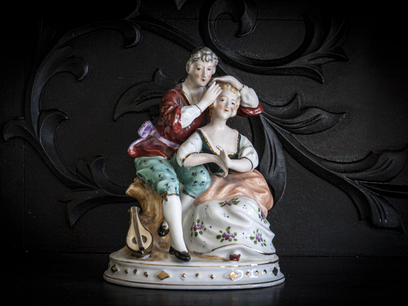
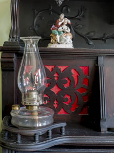
Original digital captureWhat I saw that I liked:This is a really cool antique desk. What I don't like in the picture:Interesting objects don't always make interesting pictures — particularly if the photographer just snaps without thinking. Guilty as charged. What I learned:I moved in and made the image at right hoping the figurines and the carving in the background might be interesting. Better, but nothing to write home about. 2nd Chances: What I might try nextNo idea with this one. It's pretty matter-of-fact. Even the expressions in the faces of the figurines is bland. They look bored, and perhaps that's why I'm bored with the image. |


