Every Picture Is a Compromise
Lessons from the Also-rans
Most photography websites show the photographer's very best work. Wonderful. But that's not the full story of a creative life. If we want to learn, we'd better pay attention to the images that aren't "greatest hits" and see what lessons they have to offer. Every picture is a compromise — the sum of its parts, optical, technical, visual, emotional, and even cosmic – well, maybe not cosmic, but sometimes spiritual. Success on all fronts is rare. It's ok to learn from those that are not our best.
This is a series about my also-rans, some of which I've been able to improve at bit (i.e., "best effort"), none of which I would consider my best. With each there are lessons worth sharing, so I will.
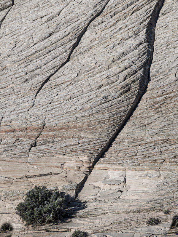
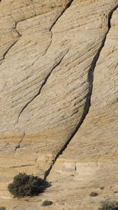
Original digital captureWhat I saw that I liked:That long, diagonal crack in the rock that terminates in a bush. I know, I'll make a tall, skinny image by use a vertical 16:9 aspect ratio in my camera! What I don't like in the picture:WRONG. This was a 12 megapixel camera that crops the image to 8.9 megapixels when used to capture in 16:9 aspect ratio. What I learned:Why throw away pixels in the field? As it turned out, I really prefer this image in my more typical 4:3 aspect ratio. Doing so to make the image at left means that I'm throwing away even more pixels! This image ends up being a scant 6.7 megapixels. I can use it on the web, but can only make a very small print. The double crop is a killer. Silly mistake. Live and learn. 2nd Chances: What I might try nextAlways — ALWAYS — capture the most pixels you can in the field. Crop at home if you want to, but at least give yourself the most pixels to crop from! |


