Every Picture Is a Compromise
Lessons from the Also-rans
Most photography websites show the photographer's very best work. Wonderful. But that's not the full story of a creative life. If we want to learn, we'd better pay attention to the images that aren't "greatest hits" and see what lessons they have to offer. Every picture is a compromise — the sum of its parts, optical, technical, visual, emotional, and even cosmic – well, maybe not cosmic, but sometimes spiritual. Success on all fronts is rare. It's ok to learn from those that are not our best.
This is a series about my also-rans, some of which I've been able to improve at bit (i.e., "best effort"), none of which I would consider my best. With each there are lessons worth sharing, so I will.
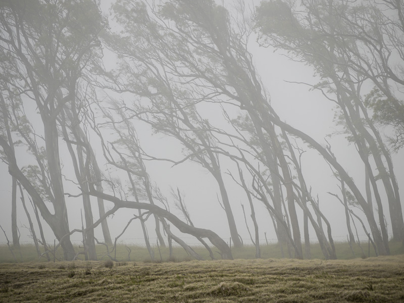
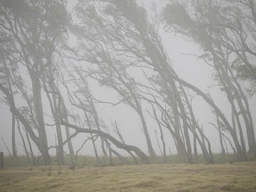
Original digital captureWhat I saw that I liked:Fog. Yay! The magic of fog is that it brings a 3-dimensionality to air. What I don't like in the picture:Unfortunately, a 2-dimensional subject — like a line of trees — will not benefit from that fog. It doesn't look like air; it just looks badly exposed and gray. What I learned:The trick is to add a sense of distance by making closer objects look like they are not in the fog. A little processing and I was able to improve it with the image at left. Still not great, but better than the above. 2nd Chances: What I might try nextThis may be a rare case where getting farther away from the subject might have helped. More air means more diffusion from the fog. |


