Every Picture Is a Compromise
Lessons from the Also-rans
Most photography websites show the photographer's very best work. Wonderful. But that's not the full story of a creative life. If we want to learn, we'd better pay attention to the images that aren't "greatest hits" and see what lessons they have to offer. Every picture is a compromise — the sum of its parts, optical, technical, visual, emotional, and even cosmic – well, maybe not cosmic, but sometimes spiritual. Success on all fronts is rare. It's ok to learn from those that are not our best.
This is a series about my also-rans, some of which I've been able to improve at bit (i.e., "best effort"), none of which I would consider my best. With each there are lessons worth sharing, so I will.
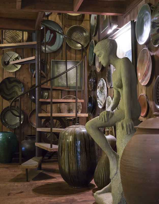
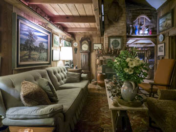
Original digital captureWhat I saw that I liked:Talk about living the art life! This fellow's house was like a personal museum of the North Carolina pottery scene. What I don't like in the picture:I kept walking through his house looking for positions that would do justice to the massive volume of pieces in his collection. It was simply impossible to do this in one image. What I learned:Showing more is not always showing more. A photograph of a place like this still has to be a pleasing photographic composition. I think my favorite of the day's efforts is the one at left. There is the sense that he is a collector without needing to show hundreds of pieces. 2nd Chances: What I might try nextA grid? A long, panorama shaped quintych? |


