Every Picture Is a Compromise
Lessons from the Also-rans
Most photography websites show the photographer's very best work. Wonderful. But that's not the full story of a creative life. If we want to learn, we'd better pay attention to the images that aren't "greatest hits" and see what lessons they have to offer. Every picture is a compromise — the sum of its parts, optical, technical, visual, emotional, and even cosmic – well, maybe not cosmic, but sometimes spiritual. Success on all fronts is rare. It's ok to learn from those that are not our best.
This is a series about my also-rans, some of which I've been able to improve at bit (i.e., "best effort"), none of which I would consider my best. With each there are lessons worth sharing, so I will.
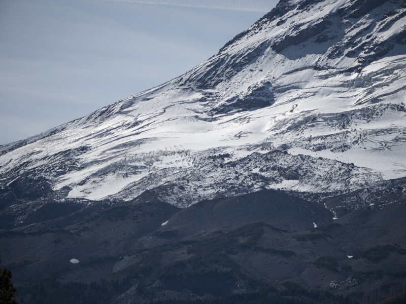
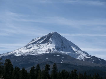
Original digital captureWhat I saw that I liked:I rarely see Mt. Hood from the east. Lovely. What I don't like in the picture:I thought I might try to make a gigantic print of this just for fun. With that in mind, I next created an 8-shot overlapping grid for eventual merging in Photoshop into a very high resolution image. What I learned:At left is the first of the 8-shot grid. When I do these, I lock the exposure and focus with the first shot so the finished composite will blend more seamlessly. Unfortunately, I missed focus on this first shot, as you can see. The entire 8-shot grid is slightly out of focus — and unuseable. Live and learn. 2nd Chances: What I might try nextI think this might be more assuredly done by using manual focus so I have visual confirmation before I proceed with the grid exposures. |


