Every Picture Is a Compromise
Lessons from the Also-rans
Most photography websites show the photographer's very best work. Wonderful. But that's not the full story of a creative life. If we want to learn, we'd better pay attention to the images that aren't "greatest hits" and see what lessons they have to offer. Every picture is a compromise — the sum of its parts, optical, technical, visual, emotional, and even cosmic – well, maybe not cosmic, but sometimes spiritual. Success on all fronts is rare. It's ok to learn from those that are not our best.
This is a series about my also-rans, some of which I've been able to improve at bit (i.e., "best effort"), none of which I would consider my best. With each there are lessons worth sharing, so I will.
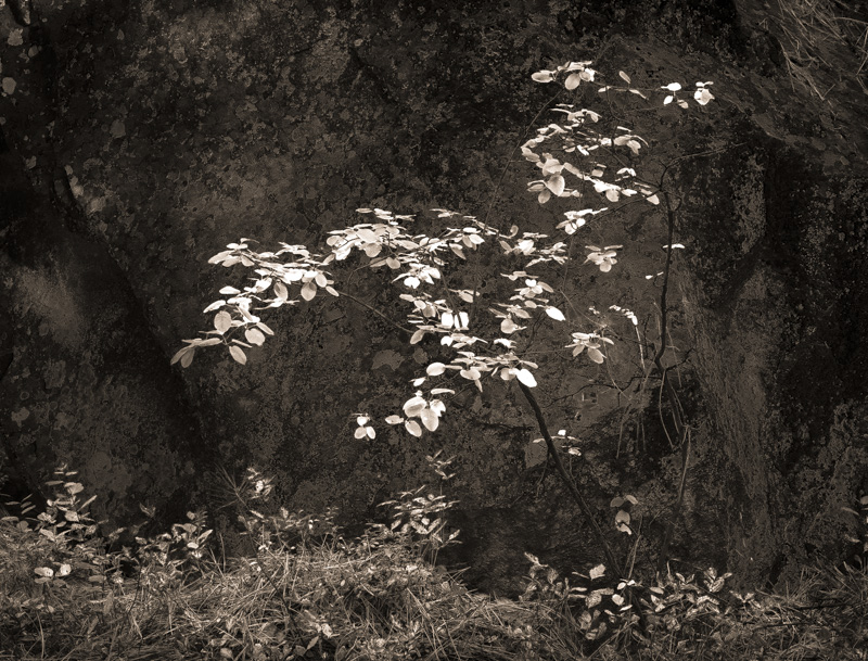
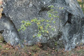
Original digital captureWhat I saw that I liked:I was hoping for some kind of juxtapositional statement about the tiny new leaves and the massive ancient rock. What I don't like in the picture:The high frequency detail in the granite boulder competes with the size and texture of the small leaves. What I learned:I thought maybe I could create a contrast between these two subjects by selectively changing their tones. The rock is sort of blueish, so I use the HSL sliders to darken the blues. The leaves are yellow/green, so I use the HSL sliders to lighten them. The resulting monochrome image at left separates the tones, but I'm not crazy about the mood of the image. Too dark and somber. 2nd Chances: What I might try nextI don't think I'm quite done with this one yet. Maybe some more subtle playing around with the tone curves might get it to spring to life. As it is, it's too heavy-handed and looks over-processed — because I think it is over-processed. This happens when I just refuse to give up on an image. I keep pushing, and most of the time it never works. |


