Every Picture Is a Compromise
Lessons from the Also-rans
Most photography websites show the photographer's very best work. Wonderful. But that's not the full story of a creative life. If we want to learn, we'd better pay attention to the images that aren't "greatest hits" and see what lessons they have to offer. Every picture is a compromise — the sum of its parts, optical, technical, visual, emotional, and even cosmic – well, maybe not cosmic, but sometimes spiritual. Success on all fronts is rare. It's ok to learn from those that are not our best.
This is a series about my also-rans, some of which I've been able to improve at bit (i.e., "best effort"), none of which I would consider my best. With each there are lessons worth sharing, so I will.
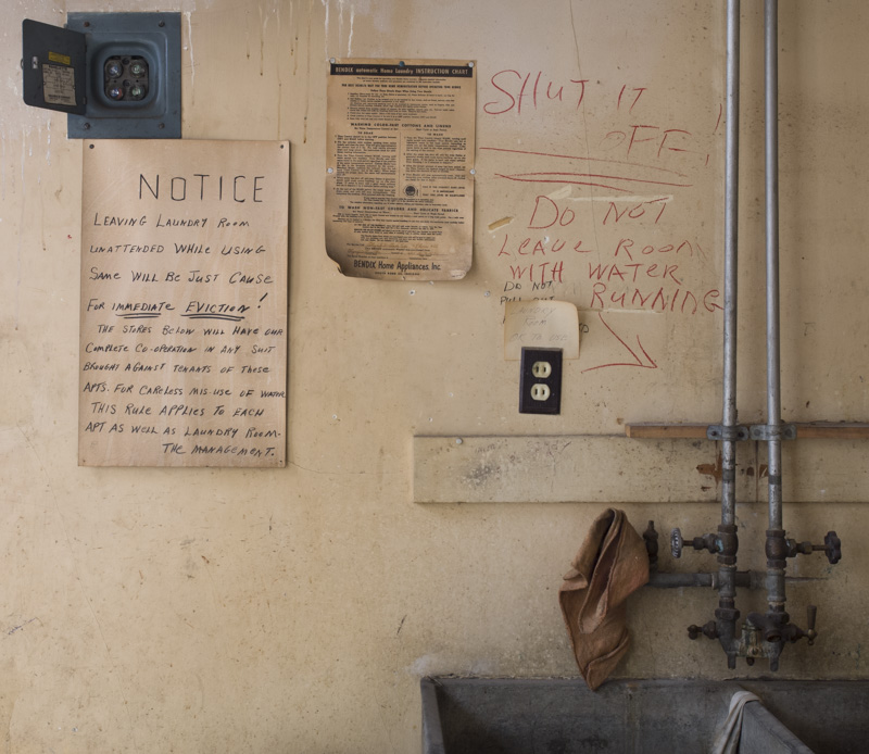
Original digital captureWhat I saw that I liked:There is a story behind that hand-written, red "SHUT IT OFF!" The age of the scene, the red rag, the presence of the person not seen — all lovely. What I don't like in the picture:I wish I could tell you what it is about this image that makes me hesitant to use it. I just can't put my finger on it. Text too small to read? That blank area in the lower left? Somehow, it's just not right, but I'll be damned if I can sort it out. What I learned:This is the only shot I made here — and I now see that as a critical mistake. If it's worth photographing, it's worth giving ourselves some options with more than one composition. I have no doubt that I could have found 5-6 alternative compositions and that one of them would have worked. Too bad. 2nd Chances: What I might try nextMaybe a lot of cropping? Never a great strategy, but it may be my only option with this one. |


