Every Picture Is a Compromise
Lessons from the Also-rans
Most photography websites show the photographer's very best work. Wonderful. But that's not the full story of a creative life. If we want to learn, we'd better pay attention to the images that aren't "greatest hits" and see what lessons they have to offer. Every picture is a compromise — the sum of its parts, optical, technical, visual, emotional, and even cosmic – well, maybe not cosmic, but sometimes spiritual. Success on all fronts is rare. It's ok to learn from those that are not our best.
This is a series about my also-rans, some of which I've been able to improve at bit (i.e., "best effort"), none of which I would consider my best. With each there are lessons worth sharing, so I will.
|
Previous image | Next image |
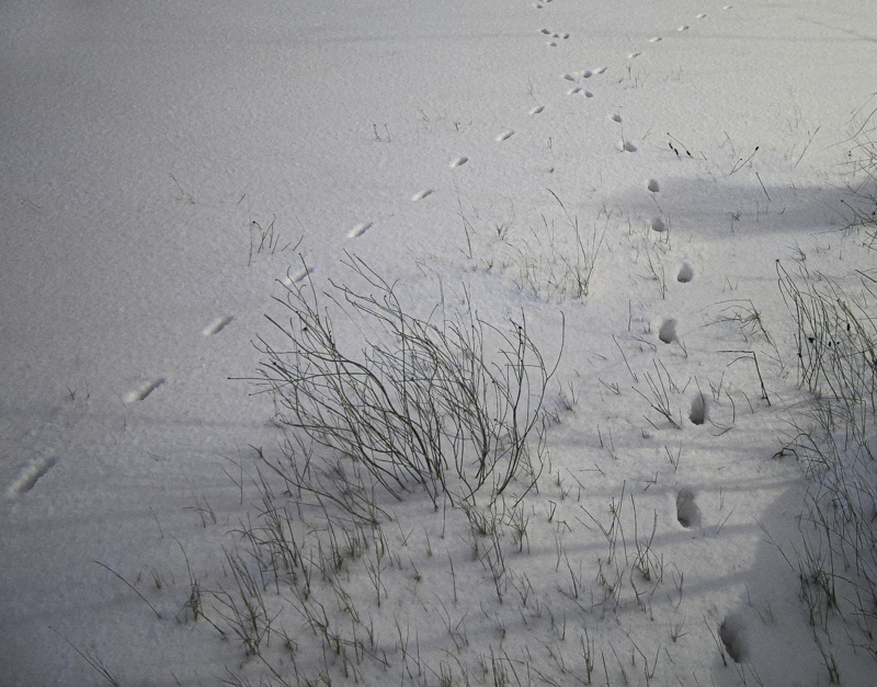
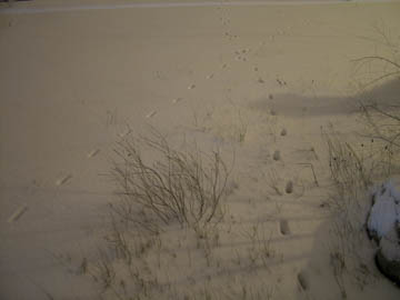
Original digital captureWhat I saw that I liked:New snow. At night. Animal tracks. This should be fun! What I don't like in the picture:In the original capture, why did I feel that boulder in the lower right corner was necessary? And the very top edge needs to be cleaned up. And that color balance from the night light is just awful. All things that maybe I can fix in post? What I learned:So, the image at left is more what I had in mind when I clicked the shutter. But here's the problem: Does this feel like it was photographed during the night to you? If I hadn't told you, would you look at it and immediately say, "A night shot!" I'm sure that I wouldn't — and that is the problem. So much of this moment is about it being photographed at night and I just can't figure out how to make this obviously feel like the middle of the night. 2nd Chances: What I might try nextMaybe I could play around with the color balance some more and find a color that would say "night" without making me want to puke. |


