Every Picture Is a Compromise
Lessons from the Also-rans
Most photography websites show the photographer's very best work. Wonderful. But that's not the full story of a creative life. If we want to learn, we'd better pay attention to the images that aren't "greatest hits" and see what lessons they have to offer. Every picture is a compromise — the sum of its parts, optical, technical, visual, emotional, and even cosmic – well, maybe not cosmic, but sometimes spiritual. Success on all fronts is rare. It's ok to learn from those that are not our best.
This is a series about my also-rans, some of which I've been able to improve at bit (i.e., "best effort"), none of which I would consider my best. With each there are lessons worth sharing, so I will.
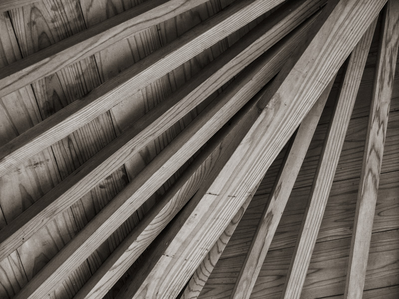
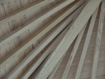
Original digital captureWhat I saw that I liked:This type of construction is so typical of Japanese architecture, particularly of older buildings. What I don't like in the picture:I've sort of let the neko out of the bag already on this one. Just looking at the image and not my text, do you have any idea what this is or why I might have photographed it? Context is critical — without it, our photographs are just shapes without meaning. What I learned:Fixing tones is easy. Took me 5 seconds to add some contrast and clarity to the image on the left. Unfortunately, that didn't help the artwork in the least. 2nd Chances: What I might try nextThere is one possibility for this image that might make sense: using it in a small project about Japanese architectural construction. I need to search through my images and see if I have more — and then figure out if I have anything I want to say about them. |


