Every Picture Is a Compromise
Lessons from the Also-rans
Most photography websites show the photographer's very best work. Wonderful. But that's not the full story of a creative life. If we want to learn, we'd better pay attention to the images that aren't "greatest hits" and see what lessons they have to offer. Every picture is a compromise — the sum of its parts, optical, technical, visual, emotional, and even cosmic – well, maybe not cosmic, but sometimes spiritual. Success on all fronts is rare. It's ok to learn from those that are not our best.
This is a series about my also-rans, some of which I've been able to improve at bit (i.e., "best effort"), none of which I would consider my best. With each there are lessons worth sharing, so I will.
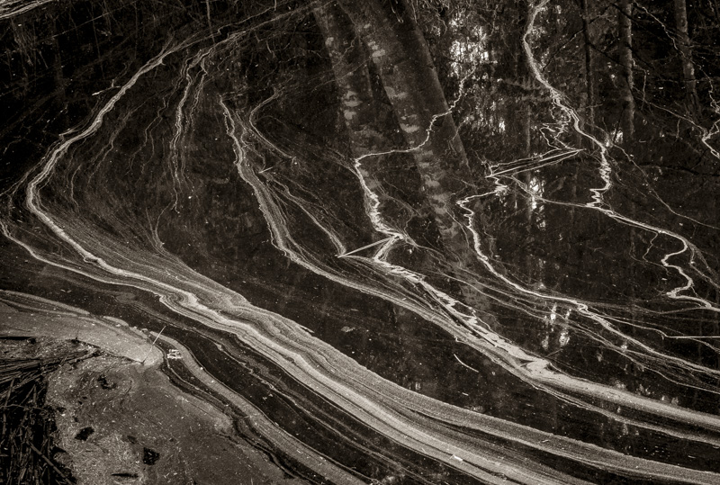
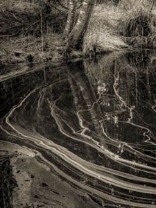
Original digital captureWhat I saw that I liked:Interesting patterns on the surface of this pond. What I don't like in the picture:The top portion of the original is wasted space. I must have thought that I wanted the trees in the picture as part of the context for the pollen in the pond. The most fundamental decision in the photographic process is orientation — vertical or horizontal. I don't often miss it, but I sure did with this one. I remember being distracted by the unsure footing at the edge of the pond and I had to lean out over the water to eliminate some troublesome branches. That's my excuse and I'm sticking with it — and cropping to a horizontal. Yikes. What I learned:Water reflects the trees. Duh. I didn't need to introduce all that other crap in the top of the image in order to have the trees be part of the composition. 2nd Chances: What I might try nextThe reflections of the sky coming through the tree branches is too busy and distracting. Could I clone them out? |


