Every Picture Is a Compromise
Lessons from the Also-rans
Most photography websites show the photographer's very best work. Wonderful. But that's not the full story of a creative life. If we want to learn, we'd better pay attention to the images that aren't "greatest hits" and see what lessons they have to offer. Every picture is a compromise — the sum of its parts, optical, technical, visual, emotional, and even cosmic – well, maybe not cosmic, but sometimes spiritual. Success on all fronts is rare. It's ok to learn from those that are not our best.
This is a series about my also-rans, some of which I've been able to improve at bit (i.e., "best effort"), none of which I would consider my best. With each there are lessons worth sharing, so I will.
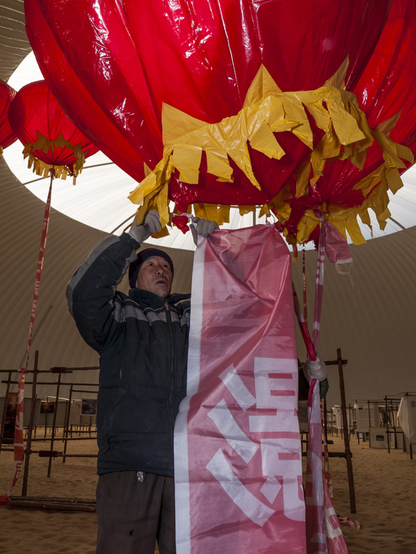
Original digital captureWhat I saw that I liked:Fun shapes and that glowing flying saucer-like white structure in the background. What I don't like in the picture:Completely missing from my original image (above) is any sense of scale. Are those red ballons the size of peas, basketballs, weather ballons, or what? No way to tell — which could be a good thing or not. What I learned:Another example of how we need to separate our experience of being there from the completely separate experience of looking at a photograph. The scale of things becomes apparent with the image at left (which was obvious to anyone standing there), but that's not a very interesting photograph. The artistic sweet spot is when scale is unnecessary or reasonably understood. Unfortunately, my original capture fails on both accounts. 2nd Chances: What I might try nextThese two image seen together accomplish something either one cannot do on its own. Is this a portential six-image project that I could develop into a photographic "sketch?" Perhaps. Not sure the images are compelling enough, but I won't know until I try. |


