Every Picture Is a Compromise
Lessons from the Also-rans
Most photography websites show the photographer's very best work. Wonderful. But that's not the full story of a creative life. If we want to learn, we'd better pay attention to the images that aren't "greatest hits" and see what lessons they have to offer. Every picture is a compromise — the sum of its parts, optical, technical, visual, emotional, and even cosmic – well, maybe not cosmic, but sometimes spiritual. Success on all fronts is rare. It's ok to learn from those that are not our best.
This is a series about my also-rans, some of which I've been able to improve at bit (i.e., "best effort"), none of which I would consider my best. With each there are lessons worth sharing, so I will.
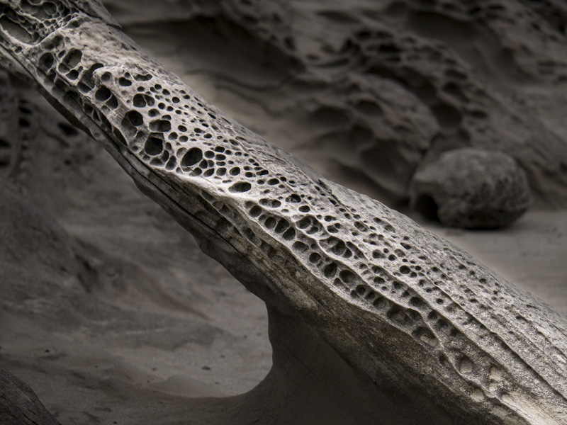
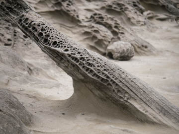
Original digital captureWhat I saw that I liked:Unusual rock structure. Diagonal composition. Good and good. What I don't like in the picture:So little contrast in the sandstone that the image is simply boring. I needed sunlight. What I learned:I tried (in the processed image to the left) to add highlights and separation. Total failure. Sometimes, you just need the light from the sun and the natural shadows and highlights only it can create. 2nd Chances: What I might try nextThis rock isn't going anywhere, but I can go back to Shore Acres on the Oregon coast and try again. If there isn't any sun, maybe a long exposure at dusk with some light painting might work. |


