Every Picture Is a Compromise
Lessons from the Also-rans
Most photography websites show the photographer's very best work. Wonderful. But that's not the full story of a creative life. If we want to learn, we'd better pay attention to the images that aren't "greatest hits" and see what lessons they have to offer. Every picture is a compromise — the sum of its parts, optical, technical, visual, emotional, and even cosmic – well, maybe not cosmic, but sometimes spiritual. Success on all fronts is rare. It's ok to learn from those that are not our best.
This is a series about my also-rans, some of which I've been able to improve at bit (i.e., "best effort"), none of which I would consider my best. With each there are lessons worth sharing, so I will.
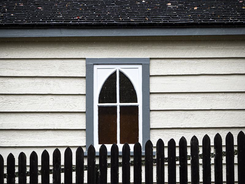
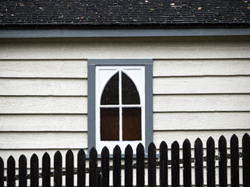
Original digital captureWhat I saw that I liked:The slanting march uphill of the fence slats. What I don't like in the picture:The merge between the tops of the center slats and the dark area of the window. Breaks the rhythm. What I learned:If I had paid attention to that merge, all I would have had to do was raise the camera about two inches and those center slats would have been entirely in the white of the lower window sill. 2nd Chances: What I might try nextWith some careful Photoshop work, I might be abled to AddendumFinally had a chance to do it and here is the result. I was right, it is better. |


